A recent study by Nielsen found that in the U.S., 61 percent of mobile phone users own smartphones. So it shouldn’t come as a surprise that responsive web design has become very attractive to programmers. The main benefit of responsive design is that it ensures the layout of a website will automatically adjust for any device’s screen size. The problem is that there’s such a wide variety of mobile devices on the market now, the mobile web experience can vary from fantastic to outright unbearable.
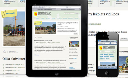
Mashable’s Pete Cashmore recently reported that Mashable.com is accessed from over 2,500 different kinds of devices. Because of such an incredibly wide array of screen sizes, Mashable shifted to a responsive design approach to deliver a more consistent experience for all users.

Credit: Kuno Creative
The goal of responsive design is to provide a great web experience that lets visitors consume content easily and navigate seamlessly throughout the site on nearly any device. While responsive design is useful, in certain cases the strategy is not so cut-and-dry.
When it comes to meeting the needs of publishers’ target audiences, it’s critical to take a look at the larger goals of the organization’s web strategy. For example, is the site’s main function as a news and information hub or for something else? Here are a number of basic considerations and examples that can help determine if responsive is the right approach.
Potential Impact on the Web Design Process
Responsive design has its drawbacks in terms of the design process. It’s important to be wary of how this can potentially impact timing. Designers will need to create three different designs: one for smartphones, one for tablets and one for desktops — at the very least.
Part of designing a website for mobile or PC is determining the placement of buttons, links, search bars and other aspects. Responsive design requires at least three versions, which triples the time and effort spent. Designers must also consider how smartphone users will use the site, compared to tablet users or desktop users.
The New Republic, for instance, uses responsive design due to the number of readers accessing news stories through tablets. JP Morgan Chase, however, found that its primary users, members accessing online banking services, would benefit more from a separate mobile site, foregoing responsive design. The bank’s members accessing their bank accounts via smartphones need a simple, straightforward way to check balances, transfer funds and pay bills.
With responsive design’s automatic resizing of website layouts, images are adjusted and the placement of page elements change, and ultimately a carefully designed look-and-feel can be compromised. In addition, with multiple layouts to review before the sites go live, testing prior to launch takes longer.
The Ad Unit Conundrum
Brand marketers are increasingly seeking premium placement for their ads, near relevant, high-quality content. With responsive design, however, maintaining the integrity of advertisements across multiple devices is a challenge because the design can inadvertently distort the appearance of ads.

For example, Polygon, a popular gaming site, uses responsive web design and ads. If you visit the site and shrink the browser width to its smallest form, you can observe the distortion of the banner ads. Most publishers rely on external networks such as Google, Yahoo and AOL to serve ads on their respective sites; however, the networks don’t accommodate for these kinds of distortion. But given that ad costs are contingent on the physical placement and display of ads, issues can arise because ad distributors have not completely adapted to responsive web design.
The ad unit issue becomes even more complicated as designers take into account the various forms of ads, from regular text, which is the simplest to deal with, to banners, to increasingly complex animated and dimension-changing ads. For sites that depend on ads as a primary revenue stream, extra caution should be taken to avoid alienating potential advertisers.
(For more on issues with advertising and responsive design, see “What’s Holding Back Responsive Web Design: Advertising” by Jenny Xie.)
Complications with Web Analytics
Analytical tools for tracking and measuring how people interact with your website have not yet caught up to addressing the nuances of measurement for responsive websites. For instance, heat-mapping software, which allows you to see visitor activity on specific pages, allows for thorough analysis of a desktop website, but fails to address mobile interactions.

Heat-mapping software. Credit: expo-MAX
Most current tools for web analytics are designed for desktop sites, not smartphones and tablets. With responsive websites, breakpoints are chosen by designers that can drastically alter a site’s layout, confusing the analytical tools.
Notice in sites like Mashable or Polygon the shift in content, images, and other page elements as the browser window changes height and width. While heat-mapping tools will accurately reflect activity for a particular screen width, most tools cannot provide the same set of analytics for responsive screen sizes.
When it comes to responsive design, organizations must weigh the impact on other vital aspects of their web strategy. Other than resizing for every screen size, they should consider the impact on the design process, existing and potential advertisers, and the ability to accurately track traffic on the site. While extremely useful in many cases, the jump to responsive web design should be taken with a grain of salt depending on the primary business drivers of your website.
Devanshi Garg is COO of Icreon Tech, where she is responsible for overall operations and business development. Devanshi has extensive experience helping organizations thrive during periods of change, from public sector organizations such as the Ministry of Health of New Zealand, to non-profits like the New York Road Runners and the Robin Hood Foundation. She also specializes in leveraging technology to enhance and automate business processes, with prior experience at Cap Gemini New Zealand (CGNZ) and as a member of the Strategy and Transformation team at Hewlett-Packard. Devanshi obtained a Bachelor of Arts in Psychology and a Masters in Commerce in Change and Innovation from the University of Auckland, New Zealand. She had a brief stint with media, anchoring two shows on national television, before launching her career in IT. When she is not at work or attending a local technology event, you will find Devanshi working out or entertaining in her kitchen.

The impact of responsive design on analytics is the most interesting. Right now, there are just so many models of devices that a site can be viewed on and can appear different on each one. With tablets gaining in popularity, and mobile phones bridging the gap between phone and tablet, the responsive design conundrum will get even more complicated as it’s being developed.
Not so much…