First came the web. Then came social media. Now journalists face a new challenge on the horizon: big data.
It used to be that data journalism lived in a corner of the newsroom, in the care of investigative or business reporters. But in recent years, big data has amassed at such a rate that it can no longer be the responsibility of a few.
Numbers, Numbers On Every Beat
In 2013, IBM researchers found that 90 percent of the world’s data had been created in the previous two years. We’d suddenly gained a quantitative understanding of our world! This new knowledge base empowers us to predict the spread of disease, analyze years of government spending, and even understand how an extra cup of coffee might affect one’s sleep quality. We’ve essentially gained countless new perspectives — bird’s-eye views, granular views, inward views of ourselves — as long as we know how to make sense of the numbers.
Many news outlets have already taken to using data to drive a range of stories, from the profound to the surprising. ProPublica and NPR calculated how much limbs are worth in each state to highlight the dramatic disparity in workers’ comp benefits across the U.S. The Washington Post analyzed 30 years of groundhog forecasts and found that “a groundhog is just a groundhog,” and not a weatherman, alas.
Still, conversations about data-driven journalism have mostly focused on large-scale projects by industry powerhouses and new outlets like FiveThirtyEight and Vox.
But the job shouldn’t be left to big newsrooms with dedicated teams. In this era of big data, every journalist must master basic data skills to make use of all sources available to them.
“There’s so much data available now, and there’s basically data on every single beat, and you have reporters getting spreadsheets all the time,” Chad Skelton, a data journalist with The Vancouver Sun, told me.
Working With Big Data On A Small Scale
Skelton was a general assignment reporter at the paper when he “stumbled into” data by way of the numerous FOIA requests he filed.
“I came across it by complete fluke while working on a project on daycare inspections,” he said.
While sifting through daycare ratings and inspection history, he had an “aha” moment: he could turn the data into a searchable database on the Web! Fast-forward seven years, and he’s now the paper’s award-winning one-man data operation. Skelton compiles library checkout data, voting trends, and local salary figures to tell unique stories about his community.
Even outlets without a specialist can tell data-driven stories. KPLU is a lean, Seattle-based public radio outlet with five reporters on staff. (Disclaimer: KPLU is also my previous employer.) Two of those reporters, Ashley Gross and Kyle Stokes, recently tackled data for an under-the-lid look at Washington state’s much-criticized tax system. Neither reporter is a data specialist, but both knew they needed the numbers to tell the whole story, which, as Stokes puts it, “had been simplified to death.”
“You can’t talk about the whole pie without knowing about each piece that makes it up. And luckily, there was a great dataset that was comprehensive, and it allowed us to take it [the system] apart,” Stokes told me.
Using basic data knowledge they already possessed, Gross and Stokes sliced and diced the state’s list of tax exemptions. They compiled their findings in a five-part series to provide the public with a much-needed overview of the state’s tax system.
Using Numbers To Show The Big — And The Small — Picture
While KPLU used data to piece together a bird’s-eye view, Skelton often uses data to funnel down big stories into small, personalized bits — something that wasn’t possible with traditional news stories.
“With traditional journalism, we tell stories with a few examples that are not directly related to the reader. Now you can search for your kids’ daycare, grandma’s nursing home,” Skelton said.
Take, for instance, a popular salary calculator he created, titled “How much do people just like you make?” The interactive feature asks the reader to enter age, gender, education level, and race, and then provides the median income for the defined group. (Click on the image to interact with the full visualization.)

It’s a neat tool that lets readers see how they stack up against their peers. But the real story revealed itself when readers began playing with the filters. Many were surprised to see how gender and race changed the numbers, even when age and education level were kept the same.
“Pretty much by accident, I had created a chart about income inequality. But by framing the chart as personal data, people were engaged by the material in a way they otherwise wouldn’t have been,” Skelton said.
How To Get Started With Data
For those who haven’t delved into data, the first step is to simply commit to try. Even if you need additional training, you won’t know what you need until you start.
Pick something small, simple, and silly as your first project; you don’t have to attempt a huge database or a five-part series. A list of names — most popular dog names, baby names, etc. — could be a good place to start. Here’s an example from La Nacion in which the paper compared the Twitter presence of heads of state (click to interact):

Of course, there’s no rule that says you must publish a story about the first dataset you decode. You can just practice with something that interests you, like your FitBit data or your newsroom’s Web analytics.
Best Practices For Data Novices
Once you start, it’s inevitable. You’re learning something new. You’ll hit a wall or two.
The key is to stick with it until the going gets easier. There are also number of tools, many of them free, that you can use to fill your skills gaps and to make the job easier. (NICAR and the Global Investigative Journalism Network both have helpful roundups.)
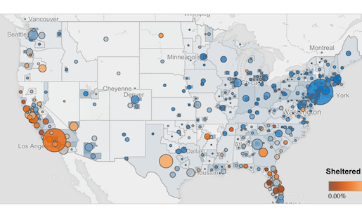
Once you’re ready to tell the story, think about how you’ll visualize the numbers to drive home the point. Show too little, and the reader may not see the bigger picture. Conversely, show too much, and you lose focus. Highlight portions. Don’t make the reader dig through the numbers to find the story, but do allow them a chance to engage. Here’s a well-balanced example highlighting the shelter shortage in the U.S. (click to interact):

After you try it once, try, try again. Take note of how others are using data, and learn from their examples. Tell the best story you can with the tools that you have.
“It may not be perfect and it may not be as polished as what the New York Times is doing, but that doesn’t mean you shouldn’t do it,” Skelton said.
The late statistician W. Edwards Deming said, “Without data, you’re just another person with an opinion.” Data hasn’t always been so abundant. Now that it is, we can fact-check assumptions, tell fuller stories and better understand the world we cover.
Martha Kang is the editorial manager of Tableau Software where she helps chronicle today’s big data revolution. A lifelong storyteller, she’s currently focused on telling data-driven stories that help us better understand our world, and ultimately, ourselves. Prior to joining Tableau, Martha worked as a journalist, first in TV news then in new media. She most recently served as the online managing editor of KPLU, an NPR affiliate in Seattle. There, she oversaw a number of projects, including the launch of Quirksee.org, a vertical site that featured two of her own award-winning stories, as well as a five-part, data-driven series, on Washington state’s idiosyncratic tax system.Martha has also worked at KOMO News, Northwest Cable News, and WLS-TV. In 2013, she was chosen as a Kiplinger fellow of public affairs journalism by Ohio State University.

Excuse me — wouldn’t “basic data skills” require an SAT-math score of at least 50%?
And serious experience, working with math?
What does the SAT have to do with data driven journalism? I don’t think you’re grasping the subject matter.
You can’t do math. Pity.
Condescend much? Grow up.
Yup, you can’t do math. Congrats.
Very informative write up about DDJ, Martha.