This piece was initially published on Storybench, a cookbook for digital storytelling. Storybench is a collaboration between Northeastern University’s Media Innovation program, a new graduate degree in digital journalism, and Esquire magazine.
“Hillary Rodham Clinton was fortunate to come of age just as the modern feminist movement was beginning to expand opportunities for women in the workplace—and in politics.”
This is how Bloomberg News introduced a recent interactive timeline that shows Hillary Clinton’s political career measured against the rise of the modern feminist movement. Christopher Cannon, a senior designer with Bloomberg’s graphics team spoke with Storybench‘s Aleszu Bajak about how they sourced, designed and built the timeline. Jeremy Scott Diamond, a developer and designer with Bloomberg graphics, provided Storybench with some of the code he used to build the timeline.
Timelines aren’t always the best option, says Cannon, but “if you can show multiple narratives and how they intersect with one another, explicitly or implicitly showing correlations or causations, you might have a great timeline on your hands.”
The best way to honor women who broke boundaries before us: Keeping it up. See the timeline: http://t.co/lB63pCTE8v
— Hillary Clinton (@HillaryClinton) August 18, 2015
How was the story pitched?
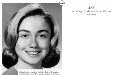
The idea for this timeline came from MaryAnn Busso and Yvette Romero, two journalists on Bloomberg’s graphics team. They wanted to show how events in Hillary Clinton’s life and career intersected with key events in the modern feminist movement, all the way to her status as Democratic front-runner in the 2016 presidential race. One of our editors, Laurie Meisler, guided us throughout the process, keeping the research focused on data to show Clinton’s life and career relative to data on women in politics and business. The timeline starts in 1964, the year Clinton was a senior in high school and first became politically active. 
Where did you find the data and sources?
Data for the three fixed charts at the top mainly came from the Bureau of Labor Statistics, U.S. Census, and the Center for American Women and Politics (CAWP). Finding data on the number of women in Congress and the pay scale between genders was fairly straightforward; finding data on women in professional occupations required a bit more digging around as records on professional women did not always exist. The data and information that populates the main columns of the timeline came from a wide variety of sources including the Eagleton Institute of Politics at Rutgers University, The Center for American Women and Politics, and Carl Bernstein’s bio on Hillary’s life, “A Woman in Charge.” We even reached out to Mattel for information on their 1985 business executive Barbie doll. Whenever information from online or printed sources seemed unclear or incomplete (which was often), MaryAnn and Yvette made plenty of phone calls for clarification.
Could you explain your process developing the timeline?
All of the data and information was entered into a spreadsheet which, when printed out, became quite long. An early sketch of a horizontal timeline came out of an Excel printout which clearly separates the content into two rows (Hillary’s life and the women’s movement) and distinguishes between numerical facts, milestones, and quotations. I started working on the design with the intention that any recurring data points for which we had yearly information (number of women in Congress, the pay-scale gap, and number of women in professional occupations) should be illustrated as small charts placed in a fixed position in the top bar and should update as the user scrolls down through time. The top bar is strictly data while the main part is what one normally associates with timelines: photos, captions, and pull quotes. With this design format in place, a user could, for example, scroll down to 2009 and read about the Lilly Ledbetter Fair Pay Act, then glance above it to see that women were still only paid 77¢ for every dollar that men earned (six years later, they now earn 78¢). We also wanted to juxtapose interesting facts between the two columns, such as Hillary’s age (32) when she became a mother in 1980 as compared to the median age of first-time mothers (23) in the same year.

The timeline at various stages of development. Credit: Christopher Cannon.
How was the timeline built?
Our interaction designer/prototyper Jeremy Diamond started building the timeline in HTML, JavaScript, and D3 further refining the design and interactions in the process. To ease the updating of the timeline’s content, he set up a CSV file that JavaScript reads which has multiple fields for both Hillary’s timeline and the women’s movement timeline, and could be designated as either photos or pull quotes. New photo additions had to follow a specific naming convention to appear in the proper place within the timeline. Adding, editing, and deleting photos became a frequent but easy task to perform.

A screenshot of the original spreadsheet. Credit: Christopher Cannon. Link to CSV of data here.
How did you put it all in the CMS?
Our team has several templates in GitHub, some for graphics that are embedded in news articles, others for stand-alone interactives like this timeline. Jeremy created a new GitHub repository and made the working timeline, and I edited the CSS to further refine the styling and update the images and text, committing any changes to the repo.
Ed note: Bloomberg developer/designer Jeremy Scott Diamond shared this snippet of code which builds the HTML by pulling from a CSV using D3. Diamond credits Mike Bostock’s queue for loading data, Gregor Aisch’s d3-jetpack for added functionality, and Adam Pearce’s graphScroll for triggering events.
Any interesting challenges? What didn’t work and what’s on your wish list to fix?
From a design or execution point of view, this was fairly quick and straightforward. The challenge lies in the content: finding it, explaining it in a concise manner, and telling a cohesive story. Keeping this graphic focused and cutting any text, data or images that didn’t support the greater narrative was the difficult part. We wanted a timeline that actually made sense and had purpose being presented as a timeline.
The content needed to be on-topic, balanced, and non-partisan and not read as an endorsement of Hillary’s candidacy. Even more challenging was finding good photos from the exact year a person or event is mentioned (hats off to the Bloomberg photo department for tracking down some of these images!). Some great photos never made it into the final graphic because they were either from the wrong year, were outside the scope of this timeline, or we just couldn’t obtain the rights to them.
What should students and newsrooms keep in mind when building this kind of a timeline project, especially on deadline?
Be clear on the scope of the story and its content, and narrow it down early on . Otherwise it could quickly become a massive and sprawling mess. Also ask yourself whether a timeline is the best way to tell the story. Most timelines are simply a series of dates and pictures, devoid of context or meaning. If you can show multiple narratives and how they intersect with one another, explicitly or implicitly showing correlations or causations, you might have a great timeline on your hands.
You can find more of their published work here. You can also follow them on Twitter.
Aleszu Bajak is a journalist covering science, energy, the environment, and health across the Americas. He’s the founder and editor of LatinAmericanScience.org, a resource for science news out of Latin America. In 2013 he was awarded a Knight Science Journalism Fellowship at M.I.T., where he explored the interface between journalists, designers and developers. He now teaches journalism at Northeastern University’s Media Innovation program and edits Storybench.org, an under-the-hood guide to digital storytelling. Before freelance reporting from Latin America, he worked as a producer for the NPR talk show Science Friday. He writes for Nature, Science, New Scientist, and SciDevNet, among other outlets.

This piece was initially published on Storybench, a cookbook for digital storytelling. Storybench is a collaboration between Northeastern University’s Media Innovation program, a new graduate degree in digital journalism, and Esquire magazine. Storybench provides an “under the hood” look at the latest and most inventive examples of digital creativity and the tools and innovation behind them. Follow Storybench on Twitter and Facebook.
