Click the the image to read our entire series. Public domain image via DARPA
Let’s start with some analysis of why I chose seven ways to incorporate data journalism into your classes. I’m Irish, and it’s my lucky number. It was my basketball jersey number, and it’s the exact number of pints of Harp I can drink before falling off a barstool.
But seriously, data, like writing a clever news lede, can be fun for journalists, students and even journalism professors. It also can be painful. So unless you want the perfect storm in your classroom or curriculum, you had best read on.
Full disclosure: I’m not a social scientist, but I have some basic training with data. I’ve taught journalism at DePaul University since 2009. I previously taught at Northwestern in the late 1990s. My background is in sports reporting (yes, we have to compile stats on deadline), copy editing and web producing at the Los Angeles Times and Chicago Tribune. I took business and research methods courses in graduate school, and worked basic spreadsheet analysis into my reporting and teaching by the mid-1990s.
In other words, if I can do it, anyone can.
DePaul is adding Data Journalism and Mobile Journalism/Wearable Technologies courses to its curriculum next fall. But some of us on the faculty have a head start – we’ve been teaching data basics in courses ranging from news reporting to senior- and graduate-level online journalism classes for the last few years.
I’ve worked data into three classes: Online Journalism II, an advanced undergraduate class for seniors; a cross-listed Online Sports Reporting course that’s predominately graduate students; and basic infographics in a graduate core course called Reporting for Converged Newsrooms.
Seven steps are key to incorporating data in your classes:
1. It’s About the Story, Not the Tools
We preach this all of the time with video and other multimedia, but it’s true for data journalism, too. Students loathe data analysis and number-crunching, but they love making visualizations. The trick is to make the analysis fun so they’ll do both.
I use part of a presentation called “Interviewing Data” by Derek Willis of the New York Times (also covered in this EducationShift special series). Derek asks his Georgetown University students to ask basic questions of data that we would in an interview – who, what, where, when, how, how much. Do this with a spreadsheet of crime data you pull off a local data portal. It gets the students sorting and filtering data, asking questions, thinking about how to write it, and, hopefully, developing questions to ask sources.
2. Start Small and Get Help
Shameless self-promotion: I curate several data visualization tools and instruction resources on The Journalist’s Toolbox. Tap into those resources as you get started.
Join the NICAR listserv and tap into the Investigative Reporters & Editors (IRE) site.
Take one of the many Massive Open Online Courses on data journalism taught by University of Miami professor Alberto Cairo, Arizona State’s Steve Doig or Birmingham City’s Paul Bradshaw. Take a Kiplinger Camp or SPJ seminar with Ohio State’s Doug Haddix. And reach out to local hackers and journalists in your area who can visit class and help your students – and you – learn new skills.
For example, I wanted to teach my students how to plot homicides using Google Fusion Tables. No problem. But I wanted to make layer that mapped by political wards and police district beats, and make it searchable and sortable. I sought out the resourceful Derek Eder, whose consulting firm, DataMade, works with media and community groups in Chicago to build searchable maps with a free template he developed.
I took a seminar with Eder last year and brought him into two classes as a guest speaker. I learned right along with the students. Now, I can teach it myself and we’re building cool, searchable crime maps.

This searchable map of Chicago homicides by political ward was built with City of Chicago data, Google Fusion Tables and Derek Eder’s searchable map template.
Never, ever be afraid to ask for help. There are so many of us in the journalism and education communities who are glad to help out. I tap into a group of pros and educators all of the time when learning new software and storytelling techniques. (Many of them accept beer at a conference as payment.)
3. Know Where to Find Data
If you’re teaching neophytes, start with your city, county or state data portals. You don’t have to start with anything too juicy. We plotted Chicago’s potholes (there are a lot of them) and fire stations for our first projects. Then graduate to Census and federal portals.
I also teach students how to use large search tools to find data on a national and international level. One of my favorite starting places: OpenPrism.
The last step: FOIAs. This can be tough in a quarter system or even semesters, but I try to work ahead with FOIAs to get some data to work with. Many students already learned how to write a FOIA letter in their news reporting classes, so I spend more time showing them tools like iFOIA.org and the new and improved Document Cloud to manage and collaborate the documents. Both are free and easy to use, so students can spend more time thinking of story ideas and concepts and less time learning every nuance of a piece of software.
We pulled restaurant inspections from the City of Chicago data portal and narrowed them to establishments in ZIP codes near DePaul University. We mapped them, put the inspections in Document Cloud and wrote a story about the findings.

Simple tools like StoryMap JS and Timeline JS, developed by the Knight Lab, can make stories visual. This StoryMap showed where Chicago ranked nationally in rising rent prices. (Answer: Too high!)
4. Just Build It, Baby
Once you have some data, tools and training, start writing basic assignments and working them into lesson plans. I typically lecture, show examples and demo software for 90 minutes, then turn the students loose for the next 90 minutes on small, ungraded in-class projects.
In my graduate-level Reporting for Converged Newsrooms class, I’ve invited election officials and research experts to share stats and research at a mini “press conference.”
Students then must write a short story and incorporate the key stats into an infographic built with Infogr.am, Canva (new and easy to use!) or PiktoChart. This teaches the students to be selective about what stats to use, as the infographics typically give them limited space (or I set a limit for them).
We’ve done dozens of them over the last couple of years: Election 2012, DePaul basketball arena, World Cup and the Chicago Blackhawks winning the Stanley Cup. We incorporated interactivity into most of them either in the base software or in a third-party tool like ThingLink.
Sports reporting classes are a great place to introduce basic data skills to students and keep them interested. During my Online Sports Reporting classes, students worked on a World Cup preview guide, building basic charts with Datawrapper, infographics with PiktoChart and telling narratives with StoryMap JS and Timeline JS.
Also have students download the free version of Tableau Public software (now available for Mac) and try building bigger visualization projects there.

We launched the Data/Chicago site with my Online Journalism II class in Spring 2014.
5. Move on to Bigger Projects
After you’ve built a few smaller projects with students, start thinking bigger. In the past 15 months, I’ve used data projects heavily in several microsites I’ve built with students: Data/Chicago, Chicago gun violence, and a look at new Illinois veterans. These take time and a lot of planning during the summer, but the payoff is big (see No. 7).
6. Show Your Work
To push administrators and faculty to let data journalism into the curriculum, you need to publish projects and share them. Our Chicago homicides mapping opened some peoples’ eyes a year ago. I’ve presented the work at several conferences and to the university’s board of directors. Administrators tend to like that.
7. Develop Partnerships
A year ago my Online Journalism I students and I launched a simple Tumblr blog – The Chicago Stumbler — that documented and mapped the city’s poor sidewalk conditions. It’s a fun geolocation assignment for students as they use their smartphones to shoot pictures of poor sidewalks and post them. Some have even used Google Glass.

If we had not built this silly little Tumblr blog about crumbling Chicago sidewalks, we wouldn’t have had the opportunity to build cool data projects with NBC Chicago.
Chris Coffey, an investigative reporter at NBC Chicago, contacted me last winter about partnering with him on a two-part series on sidewalks. We got the 13 students involved. We FOIAed public documents, shot more sidewalk photos, interviewed people who’ve been injured by tripping on sidewalks and put Google Glass on sidewalk repair teams. The documents and maps show astonishing numbers: $6 million in injury lawsuits paid by taxpayers and a city that’s lagging in repairing the 10,550 sidewalk complaints it received in one year.
It was the perfect marriage of shoe-leather journalism and data reporting. And it’s a great opportunity to get students working with mainstream media.
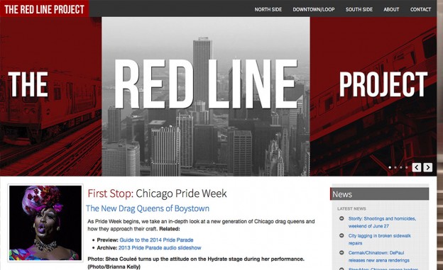
Mike Reilley has spent more than a decade teaching fundamentals to college journalists. His students work for ESPN, Sports Illustrated, The Associated Press, Miami Herald, Chicago Tribune, NBC News, The Food Network, Variety, Hearst Television and GateHouse Media. He founded and editsThe Journalist’s Toolbox for SPJ, and he publishes student projects on The Red Line Project, a community news site in Chicago. He also advises DePaul’s award-winning SPJ/ONAstudent organization. Tweet him @journtoolbox or @redlineproject.
