We took a leap into mobile in 2008 at the West Virginia University P.I. Reed School of Journalism as part of a rural mobile early adoption initiative to help address West Virginia’s digital divide.
Facing a digital divide of our own, we launched Mobile Main Street, intended as an early experiment in community mobile publishing and sponsored content, without any development resources in place. We built our first primitive app in early 2009, cobbled together with the then beta and now defunct Yahoo Pipes coupled with Google Maps. And it worked! Sort of.

Mobile Main Street
But it became clear within those first few months of experimenting that our ideas, and the mobile landscape, were outgrowing our tools and skills at breakneck speed. The project became less about publishing or journalism at all. Navigating obstacles became the central activity of our work.
Initially frustrating, this roughshod navigation through unknown terrain nevertheless had the advantage of steadily increasing our tolerance for change. The excursion, in retrospect, altered our perception of failure as an obstacle, and acclimated us to a lurching ride of perpetual iteration. This evolved into a process we now call “Build and Break” with its own set of guiding principles — and with an expectation of breakage around every corner.
Seek the lowest threshold
At the time, taking on a mobile initiative required skills that were not necessarily native to schools of journalism, including product development and coding in multiple languages. Newsrooms and schools of journalism have since raced to address these deficits through interdisciplinary partnerships, revamping curriculum and considering the need for programming specific skills with new hires in both the classroom and the newsroom. Our initial solutions were decidedly less formal: We hastily recruited a graduate student who had a modicum of interest in mobile development and signed up for an Apple developer license. Although in 2008, the iPhone was still novel in our community of users (and we were chastised repeatedly for working in a platform that reflected a fraction of our audience), we also knew that coding for iOS offered the lowest threshold for entry into mobile.
Grad student as digital Swiss army knife? Check. Apple developer license? Check. These were just two of many practical considerations that would come to trump most of our aspirations (and conventional wisdom) at the time. The sophistication of our colleagues, students and developers, and the robustness of the tools have grown exponentially since those early days of mobile, but this early principle of seeking the lowest threshold possible to enable entry holds true as we continue to pursue development in new technologies.
Don’t revise, invent
In our first round in designing a mobile application, we momentarily considered advertisements as a possible revenue stream, but this was in conflict with our intended experiment in new economic models — which, in the case of Mobile Main Street, was to re-imagine the relationship between a small media brand and its advertisers into former advertisers. This decision also reflected another guiding principle for our efforts: Don’t revise, invent. We saw no value in replicating existing digital products, such as banner ads, in mobile space, so we rejected these outright in pursuit of unknown models.
Build for the future
We spent the first three months of our first mobile project in negotiation with a 2009 geo-mapping startup, PointInside, that provided mobile way finding for retailers in malls and airports. This pursuit became an immediate obstacle. Their app integration relied on custom mapping, and we couldn’t justify investing in proprietary maps that would not be transferable. At the time, there was not sufficient mapping in rural West Virginia to make use of Google maps in creative ways that might replicate this firm’s existing products. Yet we elected to build the project around Google maps, trusting that areas of West Virginia, and other remote rural communities would eventually be fully mapped with robust, accessible, and free tools. This decision enabled us to keep one foot in the low-threshold present while focusing efforts in anticipating likely future solutions.
Sacrifice quality to gain entry

David Pavelko, Head of Travel at Google. Photo by World Travel & Tourism Council and used here with Creative Commons license.
David Pavelko, head of Google Travel, in a visit to our program early in this project, urged our students, “If you’re innovating, just get it out there. Everyone wants to get it ‘just right’ or to perfect it first, but not in this market.” We heeded his advice, conceding that getting it perfect was not in our repertoire, and realizing we were not alone in harboring an ongoing crisis of confidence. The value of this perspective was that our first efforts in mobile development, while of low quality, enabled entry into the landscape. We came to accept that what I often referred to as a “duct tape and bubble gum” approach was a good enough place to start. I visited a startup firm in this process and saw a prototype for an augmented reality product composed of paper puppets, Post-its and tape: Lo-fi Prototyping, the developers explained. This validated our emerging, if counterintuitive, principle: Sacrifice quality to gain entry.
Focus on culture and behavior over application and device

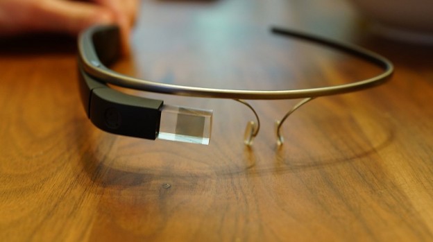
Currently we are immersed in developing an application called Storyville for Google Glass, and rather than shelving these lessons as mementos of a reckless ride, we have formalized them into a baseline strategy for entering the fray. Stay tuned.
Despite our willingness to sacrifice quality to gain entry, we were frustrated with our own limitations working in a native application environment at a competitive level. We simply didn’t have the advanced coding skills to create custom native applications for mobile, which was a rapidly evolving platform. We used some of the first app-building tools to enter the market in 2009, but those beta tools — and everyone who used them — were caught in the same maelstrom of change.
In February 2010, I was relieved by this post from the project management app Basecamp explaining their rationale for launching a mobile web app instead of a native app. I felt emboldened to pursue ways to app-ify a web experience rather than struggling, still without a developer, to deliver multiple, specialized native apps in dizzying, evolving platforms. As the movement toward appification of the web accelerated that year, I realized our workarounds could be considered incremental innovations.
Simultaneously, our commitment to using low-threshold products created a tenuous reliance on products that were themselves in flux. For example, our use of Twitter as a reliable content engine for the app was threatened in the summer of 2012 when Twitter announced they were limiting third-party integration with their API. As insignificant members of that ecosystem, we were able to adjust, but it became yet another lesson on the fragility of the landscape.
This initiated what may be our most important lesson at the heart of our Build and Break approach. We had become almost exclusively focused on navigating upheavals in developing for device — and with no end in sight — we simply stopped longing for an “end in sight.” We began to evangelize about change itself, and shifted the nature of our project from being skills-based to experiment-based. We stopped teaching and started co-inventing.
Lectures were replaced with frank conversations confronting the volatility and culture of technology. The terms digital divide, technology disruption and early adoption became a part of the vocabulary we shared with the project’s communities. We began to focus on culture and behavior over application and device. This remains a relevant principle in our current experiments entering the volatile wearable tech landscape.
Dana Coester is an Assistant Professor at the PI Reed School of Journalism, West Virginia University, and also serves as the Acting Creative Director for the school’s media innovation center. Coester’s work focuses on community media and the economic development potential in technology disruption. Her research examines the future of storytelling with special interests in mobile behavior and experiments in new narrative forms in digital, mobile, augmented reality and wearable technology. Coester earned her master’s degree in Journalism from the University of Missouri-Columbia in 1993.