In the past, old elections data might languish on microfiche or in boxes, dusted off occasionally by a political scientist or presidential historian.
But in the run-up to Sao Paulo, Brazil’s Oct. 7 municipal elections, one newsroom has reimagined data from nearly two decades as an animated video that engages the public and draws people to its website and YouTube channel.
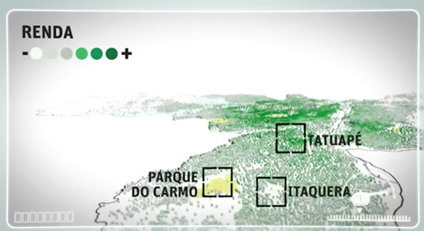
The daily newspaper Folha de Sao Paulo took voting data from every municipal, regional and national election since 1994 and mapped the locations of votes throughout Sao Paulo. The result is an innovative animated video — and a model for how newsrooms can bring data to life.
The 3-minute clip, embedded below, depicts a helicopter — the “Folhacóptero” — whose pilot flies above the city, explaining the often-polarized political landscape below.
“Considering the amount of data [used] in this story, there is no doubt that data visualization is the best way to show the trends,” said Gustavo Faleiros, a data journalist who consults for Folha as part of his Knight International Journalism Fellowship. Presenting the information visually makes it “easy to understand and actually a fun way to learn about the past elections in the city.”
Folha art department editor Mario Kanno coordinated the efforts of three journalists, a video editor, a graphic designer, and a programmer to create the animation in just three weeks. They obtained, cleaned, and analyzed the data, added income information for context, mapped it with Quantum GIS, then used Cinema 4D software to animate it.
The Folha crew won’t stop there: Faleiros says the Folhacóptero will take off on three more “data flight routes” during election season.
Jennifer Dorroh is a digital journalist and media trainer who directs the International Journalists’‘ Network (IJNet) at the International Center for Journalists in Washington. Follow her on Twitter: @jendorroh.
The post originally appeared on the The International Journalists’ Network’s site, IJNet.org. IJNet helps professional, citizen and aspiring journalists find training, improve their skills and make connections. IJNet is produced by the International Center for Journalists in seven languages—Arabic, Chinese, English, Persian, Portuguese, Russian and Spanish—with a global team of professional editors. Subscribe to IJNet’s free, weekly newsletter. You can also follow IJNet on Twitter or like IJNet on Facebook.

