Data visualization is taking the web by storm and, with a little luck, it might be the next big thing in online journalism. Buoyed by the open data movement and accelerating change in newsrooms around the country, it has become something more than just flashy graphics and charts — it is a new form of visual communication for the 21st century.
In the coming months, I’ll be writing about this emerging field for MediaShift. We’ll cover best practices, free tools and resources. We’ll also analyze the best of the best and talk to some data visualization or viz bloggers about what’s hot and what’s not. From time to time, I’ll share some of my own data viz experiences with you and seek your feedback.
What is Data Visualization?
At its core, data visualization is the visual representation of information served up with a healthy dose of innovation and creativity. A truly stunning data viz becomes more than the sum of its parts. This new digital alchemy can turn a simple spreadsheet into something that can shake up the debate, measure progress or even change the world.
This periodic table of visualization methods by the folks over at VisualLiteracy.org illustrates a number of different elements or viz building blocks. A data viz can take the form of an infographic, a timeline or a map. It can be a motion chart, a short video clip, an interactive dashboard, or even a web app.
Below, you’ll find six examples of data visualization from around the web and across the globe that provide an overview of the techniques and approaches to data visualization.
1. Work With Passion Like Hans Rosling

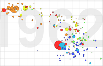
Any discussion about data visualization has to start with Hans Rosling. He is a professor of international health and co-founder/director of the Gapminder Foundation. He created the Trendalyzer, an advanced motion chart that makes statistics come alive.
If you are not excited about the power of data visualization, you will be after this video of his talk at TED where he talks about health in the developing world. The magic begins at around three minutes in:
You can make your own international health comparisons using an interactive motion chart or download the free Gapminder desktop application for a hands-on data experience.
2. Visual Can Also Be Visceral
Latoya Egwuekwe, a former classmate of mine at American University’s Interactive Journalism program, made national headlines with her visualization of county-level unemployment data. See it for yourself: The Geography of a Recession. This viz has received over 1 million hits since it was launched in October 2009.

Every day, I work with labor statistics and I am still floored every time I see this viz. It goes to show that you don’t have to be a pro to have an impact. Around the web, students, citizen journalists and bloggers are breaking new ground.
3. Making a Story Hit Home
Data visualizations can be used to tease out and illustrate trends from data in new and unexpected ways.
Timothy Noah over at Slate introduced the concept of “the Great Divergence” and then he used a data viz to take readers on a visual tour of income inequality in America.

Dubbed the United States of Inequality, this 10-part series and viz shows a widening income gap.
4. Use Motion to Move Your Audience
A visual look at aging around the world by General Electric incorporates motion beautifully. It allows you to compare age cohorts from different countries over time — think Baby Boomers, Generation X, etc. Watch as your generation grows old and dies based on United Nations population projections.

This viz is called Our Aging World and is presented as an interactive motion chart.
5. Seeing Something in a New Light
This viz by NMAP.org shows the web like you’ve never seen it before. If you’ve ever clicked a mouse before, you’re probably familiar with favicons — the tiny images that appear next to the website URL in the address bar of your browser. This viz includes close to 300,000 of them.

The size of a company’s favicon corresponds to the reach of its website on the web. As you might have guessed, Google is the largest. Check out Icons of the Web, a gigapixel image with an interactive viewer.
6. What’s A Billion Dollars Between Friends?
Visualizing numbers can add context to any story. Last but not least, we have a viz by Information is Beautiful’s David McCandless. It’s called the Billion Dollar-O-Gram and is an interactive tree map. He created this viz out of frustration with media reports citing billion-dollar amounts without providing the proper context.

Not only is this viz useful and informative, it’s also an example of open data in action. McCandless does something that should be an industry standard — he links to the entire data set used to create the viz. You can also see how he has updated the viz over time; view the original version, which uses different facts and figures.
How Else Can Journalists Use This?
Besides using them to tell data stories, journalists can use visualizations in the newsroom or on the go for several essential activities. Here are a few more examples of how data visualization can play a role in finding, processing and communicating information:
- Getting your news fix: Newsmap
- Researching a story: Sunlight Labs’ Politiwidgets
- Analyzing large data sets: Business Intelligence Guru’s Unemployment Dashboard
- Staying plugged in to social media: Twitterfall
- Having a laugh: Dipity’s Timeline of Internet Memes
The Most Beautiful Viz You Have Ever Seen
What is the most beautiful viz you have ever seen? What is your favorite viz of all time?
My pick for most beautiful is more form than function. It’s Chris Harrison’s Visualizing the Bible. Check it out for yourself.

My current favorite viz is a triple threat. It’s beautiful, useful and also a great way to link to old movie reviews. It’s the New York Times’ Ebb and Flow of Movies.
I’d be doing you a disservice if I also didn’t share with you a data visualization that I produced. This viz examines the state of the nuclear stockpile, and is called Between Five Countries, Thousands of Nukes.
Please share your favorite examples of data visualization in the comments, and stay tuned for my future posts about this emerging storytelling form.
Anthony Calabrese is journalist based in Washington, D.C., who specializes in data visualization and digital storytelling. He works as a web producer for the State of the USA where he blogs about measuring the nation’s progress. Previously, he worked as a data researcher on the Best Colleges and Best Graduate Schools publications at U.S. News & World Report. He holds a master’s degree in interactive journalism from American University and is an active member of the Online News Association.
You can follow him on Twitter @2mrw
