It’s not often that you find an Internet trend based on something ancient. But that’s what’s happening with maps. Google Maps has gone from innovative to indispensable and highly replicated in a little over two years. Thanks to Google’s open map API (appliction programming interface), just about anybody can create a map for just about anything — from tracking housing prices to finding the best sushi in their city. Even mainstream media has tapped into the mapping craze, with publications like the Los Angeles Times, Washington Post and others including mapping as part of their online offerings.
With open Internet mapping, users and developers have become increasingly hooked on geography, putting any kind of data into the context of a map. With this, our relationship with maps is becoming an interactive one; not only do we obtain information from maps but we also contribute to them and customize them. Along with all the casual mashups, the success of Google Maps has spawned a burgeoning cottage industry in interactive mapping. Indeed, a whole conference on the topic of location technology, dubbed Where 2.0, just blew through the San Francisco Bay Area, and is already in its third year.
There’s a lot going on in online mapping these days among players big and small, and it’s interesting to see how, in just a couple years, Internet cartography has gone from merely utilitarian to entertaining and social. There are three particular trends I’ve been watching: 3D mapping, data-sharing maps, and social network mapping. Here’s a rundown of some of the newest and more buzzworthy projects in those areas.
3D Mapping and Local Search
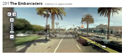
The mammoth of Internet mapping is, of course, Google Maps. Then came Google Earth, the application that lets you zoom into an aerial view of just about every place on the planet. It didn’t seem like there was much room for innovation after that, but Google went further with 3D mapping, releasing Google Streetview a couple weeks ago. Not only can we fly over our own homes, but also zoom down to street level and practically tour the city on virtual foot. At this point, there are only a subset of streets covered in cities such as San Francisco and New York. To create Streetview, Google placed a multi-lensed camera on the top of a car and took the vehicle on a tour throughout the city. The results are quite good, and I can cruise smoothly along my street and almost see into my own apartment window (yikes!).
While Google might be the main name in Internet mapping, Microsoft beat them in releasing their version of a 3D street level map of major cities by about six months”. Microsoft’s Live Search 3D maps came first in providing users with 3D views via a browser, something which Google (up until last month) offered only on Google Earth for certain landmarks. A key interest at Microsoft is local search, and it is incorporating information like business listings and traffic information into those maps. And Google just last week announced that users will be able to get public transportation information on Google Maps for some cities.
Data Sharing on Maps
Quite a few of the newer mapping applications center around the idea of sharing data publicly, and plotting data on a map. One of the more involved data-sharing map applications is Geocommons, a service that creates “hot maps” based on data chosen by the user. A particularly interesting example of how this works is a map charting support of Democratic presidential hopefuls Hillary Clinton and Barack Obama, which geographically tracks where their campaign contributions come from. The data used to create the map was obtained from the Federal Elections Commission and plotted on a map of the U.S. to provide an instantly understandable and dynamic representation of what might be — in its original spreadsheet form — just boring data.
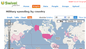
Another fascinating data-sharing project incorporating mapping is Swivel. While it originally began as a social networking site centered on data contribution through charts and graphs, Swivel recently added mapping to the mix to show where you are in relation to all the world’s data. A testament to the power of the geographical viewing of data is a Swivel world map which charts military spending by country, which, with just a casual glance, shows the United States’ clear leadership in this area.
These are the types of mapping functions that various media organizations have experimented with, and it wouldn’t be surprising to see these companies partner with services like Geocommons and Swivel in the future.
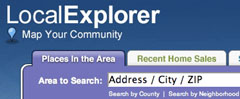
Many media companies have already used data-sharing maps to provide local information to readers. The Washington Post’s Local Explorer helps people track crime, home values or school test scores in the area. Along the same line, LATimes.com takes crime data on maps a step further on their strangely fascinating Homicide Report blog. Every known homicide in Los Angeles is posted on the daily blog and, using the information in the report, plotted on a Google Map. That information can be further searched using a list of victims’ names. In this case, one look at the map makes a stronger point than any dry statistics could at showing the city crime problem.
Mapping Social Networks
Online social networks seem to be made for mapping. With users connected to each other in different parts of the world through different mediums, the phenomenon lends itself to being charted geographically. Twittervision, a map application based on the micro-blogging service Twitter lets you see the open public conversation going on literally across the globe on a constantly moving world map.
Developer David Troy created an identical application Flickrvision for the photo-sharing community Flickr. As you focus on a photo just submitted from someone in Stockholm, two seconds later the Flickrvision map spins and takes you, with dizzying speed, to Mongolia as another photo is uploaded from there. Flickrvision is not for those prone to motion sickness.
These “vision” services allow people to visualize community sites, but FatDoor takes the concept further by letting you network with people in your geographical neighborhood. Need a car pool buddy? You might find that your neighbor down the street does, too. Curious about whether that new pizzeria down the street is any good? Your neighbors have the answer. FatDoor helps users connect with the people and businesses in their immediate vicinity — that group of people we might have considered a “social network” before the Internet. And while local ratings services such as Yelp have the business recommendation side of this concept covered, the “neat” factor of FatDoor is that recommendations come from neighbors, and you can see exactly where they live on a map.
So why are online mapping sites so popular? I think there’s something about mapping that makes us feel like a part of something bigger, and makes the Internet more tangible. Seeing yourself on a map, and noting how near (or far) you are from someone else make the virtual world seem more real. Unlike so many other things available on the Internet, maps have a clear raison d’etre, and can be used to communicate information in an effective, efficient and accessible way. As media sites try to find ways to get readers to participate more online, maps might help to further engage readers and allow more participation in the stories that affect them.
To learn more, check out these mapping sites and blogs:
SlashGeo
Online resource on mapping and everything geospatial.
The MapRoom
A blog about maps of all types, both online and off.
Mapping Services
eConsultant’s list of mapping services.
Google Maps Mania
Blog covering Google Maps and its various spinoffs.
Google Sightseeing
Blog tracking interesting sights found on Google Maps.
DeadCellZones.com
Shows cell phone “dead zones” on maps.
Schmap
Provides graphical travel information on interactive city maps.
Flagr
Allows users to map their favorite places, and add photos and videos.
Frappr
Social networking with your site visitors using maps
Photoenforced.com
Tracks photo-enforced traffic light locations.
Busmonster
Helps commuters in Seattle find public transportation.
Public Loos
Find a public bathroom in San Francisco using Google Maps.
Panoramio
Social networking for people who photographed the same locations.
What do you think about using maps to share information and for social networking? What map applications do you use and what makes them great? Share your thoughts in the comments below.
Jennifer Woodard Maderazo is the associate editor of PBS MediaShift. She is a San Francisco-based writer, blogger and marketer, who covers Latino marketing at Latin-Know and Latino cultural issues at VivirLatino.

An excellent overview, perhaps our physical environment is still retaining some appeal…
I wonder if Google’s Streetview will be available through the Google Maps program being offered on the iPhone.
That would be very handy indeed.
A lot of the Where2.0 presentations are available for download at IT Conversations.
The more maps the better. Just think of reading two history books, one with plenty of maps, and the other without. I’m most in need of good maps when reading the news, and the availability of these resources is an incalculable benefit.
Hi Mark: Interesting article. Regarding Google Streetview, you wrote “at this point, there are only a few streets covered in San Francisco and New York”, but Streetview also covers Denver, Las Vegas and Miami.
Neil,
You’re right. I changed that in editing and made it incorrect. I’ve changed it back to say that SF and NYC were among many cities covered by Google Streetview — and we all know that the number of cities covered will go up over time…
Mark: Great overview on mapping. If anyone is interested in “10 takeaways” from the Where 2.0 conference — mostly from a local point of view– I’ve posted them on my blog:
http://localonliner.com/?p=397.
Mark: Great overview on mapping. If anyone is interested in “10 takeaways” from the Where 2.0 conference — mostly from a local point of view– I’ve posted them on my blog:
http://localonliner.com/?p=397.
http://www.MapJack.com has online map service and location finder in San Francisco showing street-level (street side) pictures of every city street and can search for businesses and actually see the front of the business.
Some time before, I needed to buy a car for my firm but I did not earn enough money and could not order something. Thank God my comrade adviced to try to take the mortgage loans at reliable bank. So, I did that and used to be satisfied with my credit loan.