
When a major newspaper announces it is redesigning its print layout or website, it doesn’t usually merit much attention. The regular readers usually complain about it, and then get used to it, and life goes on. But in the case of USA Today redesigning its website, there was more at play than a new look; the site added social networking-type features and an added emphasis on reader comments and interaction.
Among the many changes:
> You can see the entire text of recent entries of the On Deadline blog on the home page of the site by clicking a “News Notes” tab.
> There are rotating quotes from all the reader comments on the home page, and reader comments on every story and even on every reader profile.
> Readers can “recommend” stories with a click of the mouse, so that you can see what stories other people like.
> To make a comment, you have to register and create a profile, a mini-version of what you might see on a social networking site such as MySpace.
> A “Blogs” section on the homepage highlights USA Today blogs as well as blogs from around the web.
> A Community Center blog highlights ways that the newspaper is utilizing its website and audience, and also points to some of the better reader input.
While most press critics have lambasted USA Today as “McPaper” with short stories and down-the-middle viewpoints, the paper has actually been ahead of the curve in many respects. It was quick to embrace color in print and its short articles are almost a precursor to web reading habits.
In some respects this revamp puts it ahead of the curve again in social media and creating community on a big newspaper website — especially for a newspaper that caters to a larger potential audience than the Washington Post or New York Times. Rather than simply talking the talk with little action, USA Today is delivering talk with a lot of action, and literally putting themselves out into the fray.
First Big Test of Reader Feedback
In the most commented-on story so far, USA Today explained why it had made the changes to its website, and was immediately inundated with attacks from readers who hated the redesign. Not only were people upset with the slow-loading pages and cluttered design, they were also angry with what they deemed to be too much emphasis on blogs and reader feedback and quotes.
“Social media may be the next big thing, but if I wanted to get my news from MySpace, I would,” wrote KLWestbrook. (Strangely enough, MySpace is considering adding news of a sort.)
Scott Karp writes the personal blog Publishing 2.0, and is managing director of Atlantic Media as a day job. He keenly noted on his blog that the new media cognoscenti were all congratulating USA Today while its readers were in an uproar. His blog post posed the perfect question: Who’s Right About the Social Media Revolution: The People or the Revolutionaries? Well, you can’t have a revolution without the people.
So how would USA Today respond to all the criticism after making the whole redesign about giving its audience a say in things? To their credit, they have already taken some action. Executive editor Kinsey Wilson went online to tell people that USAToday.com had tweaked its design to remove some white space and speed up page loads. (It was still generally slow for me this afternoon.)
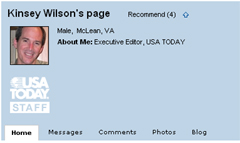
“We’re actively looking at ways to speed the loading of the homepage and our main section pages,” Kinsey wrote in a comment. “On Tuesday night we made some adjustments that significantly improved the speed with which the top of the page renders in the browser. And we’re continuing to look at code, content and configuration changes that will improve the overall performance. We also just added an ‘Essentials’ navigation bar to the homefront that restores easy one-click access to some of the most highly trafficked features.”
Not only is Wilson commenting in the forums, he also has a profile on the site just like the readers. It’s hard to imagine New York Times executive editor Bill Keller doing the same thing on NYTimes.com. Plus, there’s a “Reporter Index” that has links to all the reporters’ stories as well as to those who have profiles. That’s a touch of transparency that leads the way for newspaper sites.
Of course there are still things to complain about at USAToday.com. The feature that lets you start a blog from your profile page does not include RSS feeds. The look is very cluttered on the home page and section fronts. Microsoft’s Don Dodge noted that most of the reader complaints were about the layout and design rather than the new social features. “Don’t change features and [user interface] design at the same time,” he wrote. “Do one or the other, not both.”
Not bad advice, and perhaps USA Today will backtrack a bit on the design. But it’s hard to imagine the newspaper site will remove the comments or new emphasis on reader feedback and recommendations. Once you let people into the conversation, it will look even worse to cut it off.
Overall, USA Today deserves an “A” for effort and for pushing ahead with innovation on its site, especially in its attempt to include readers in both feedback and in story generation. These are the types of experiments that have to happen for any big news organization to know whether they can indeed walk their talk about networked journalism and audience involvement.
Here are more takes on the USA Today site redesign:
USAToday.com Refashions Itself as a Social Network from Steve Rubel at Micropersuasion
From the ‘all software should be social’ department
from Rex Hammock
Bravo to USAToday from Michael Arrington at TechCrunch
USA Today goes social with redesign
from Bryan Murley at Innovation in College Media
Can a newspaper be a social network? from Mathew Ingram at the Globe and Mail
What do you think about USA Today’s redesign? Do you like the new features but hate the design? Do you think they should backtrack on it because of reader feedback? Share your thoughts in the comments below.

Mark,
I am a huge fan of the social features and believe this is a huge step forward. I think this is a great blueprint for what local papers should do. I actually think it will work better at the local level than for a national paper like USA Today.
I think there may be a lesson to be learned though in how to roll these things out. I’m wondering if they did focus groups about the design and new features? Or if they had some beta testers kick the tires a bit before launch? It seems like these steps might have identified problems in the site’s usability before a broader launch.
Most of the problems people are having are usability issues that it is nearly impossible for designers/developers who are in the weeds to notice (I’ve been there). It seems like these steps might have helped.
But once again, I believe USA Today is going in the right direction and applaud their effort.
Todd
I definitely agree with the “A” for effort. When so many newspapers are standing by the sidelines as others eat their lunch, at least they’re trying something.
Its the closed nature of the mainstream media that gave rise to the political blogosphere. If mainstream sites were more like the newly redesigned USA Today four or five years ago, its quite likely that much of the enthusiasm and energy (and page views and ad dollars) that bloggers are able to tap would have belonged to newspapers.
Instead, reporters preferred to preach from atop the mountain, viewing interaction with readers as beneath them.
That said, I think USA Today is giving too much emphasis to a tiny part of the population. I did some analysis using numbers posted on the Statesman Journal (another Gannett paper) site:
http://blog.agrawals.org/2007/03/08/hard-numbers-on-reader-participation/
For all of the talk about new experiences, there are plenty of unpleasant old ones. The first thing I saw was a giant rich media ad for FedEx that pushed all the news off the screen. Clicking on a story took me to an interstitial ad. When I finally got to the story, I got a pop up for mortgages.
It’s one thing to integrate the use of blogging and user-centric technology in a news environment, but it’s quite another to allow every user to comment on every last story. As if USA Today wasn’t dumbed down enough already…
Todd, I think you’re right about the need for testing with the design. Especially the page-loading times should have been worked out.
But I think Rocky’s comment on ads and Dave’s on reader comments are irrelevant to what’s happening. There will always be ads on free sites like this one, and some will be obnoxious. That’s a given on most major news sites. And if they can improve the comment ratings so the best ones come to the top, a la Slashdot, they won’t be as horrible.
I do agree that it’s more difficult to build community or communities in a national publication, though Topix.net has done it as an aggregator and USA Today could build them around niche content topics and on their blogs. This is only a first step, so there’s plenty of time for improvement and fixes.
I’m not dismissing the need for ads, I’m criticizing the poor execution of them. Between the horrendously slow load time for the front page and the obstacles to getting at content, I won’t likely be back.
Ads will always be necessary to support free sites. And despite what purists say, ads are valuable content – as long as they are relevant to what the user is looking for.
Unlike most people in focus group testing, I freely admit finding ads valuable and clicking on them.
But these ads are like the guys who stand on The Strip in Las Vegas pushing cards for strip clubs and prostitutes in your face when you’re trying to get to your hotel.
However coincidental, I’m glad you mentioned the addition of the OnDeadline blog first among your list of changes because I think that tabbed design is the real innovation here.
The tab loads the entire content of the blog onto the home page instead of taking readers off the page to another section.
They’ve done the the same thing with the most popular headlines list. It’s just another way to sort your news: 1) By what the editors said is important, 2) By what’s happened latest, and 3) By what is most popular, or what readers say is most important.
The prominent play of social networking is what’s getting the most attention among folks, but this idea of sorting news on the home page deserves more attention.
Get a fast and reliable loan today with guarantee, i Mr Hopkin Matt, a legal owner of a fast and reliable loan service, we issue out both short and long terms loan to business setups, student, bad credit cards, personnal loan, etc, at low interest rate of 5%, any one interested should indicate by sending a via email: [email protected]
Quite an interesting
figure. I always thought regular readers only post quality comments on the
blogs,.!