Journalists needing a lean tool to create embeddable visualizations in a snap can give Silk a try.
Silk is a data publishing platform that turns static spreadsheets into dynamic, customizeable web pages and embeddable visualizations, and the 3-year-old company recently launched a dedicated section just for journalists.
Newsrooms like the Atlantic, Wired Italy, Huffington Post and more have already started experimenting with the “all-purpose tool for data journalism.” Mashable used Silk on a deadline, creating a donut chart of companies whose passwords were hacked. The Daily Dot used it to visualize racial disparity of police arrests in Ferguson.
Journalists can use the tool to make their own “Silks,” or data visualizations, around any spreadsheet of data they choose. Once you upload a spreadsheet of data, journalists can toggle instantly between 11 visualizations – like grid, map, scatter plot, donut chart – for that data, and then can embed that particular view directly into a story with an iFrame.
You can also publish your visualization as a web page on Silk, where you can add in extras like Twitter streams, YouTube videos, SoundCloud audio, text blocks and more, giving you greater flexibility for data storytelling.
“Kind of like a Storify on steroids,” said Alex Salkever, head of growth at Silk. Salkever reports about 50,000-60,000 users, and a million and a half pages have been created.
And the kicker? It’s free. “There’s no charge for journalists, nor will there ever be one,” Salkever said.
The Silk road begins by turning every row on a spreadsheet – either Excel or a Google Sheet – into a web page, essentially changing it from a horizontal representation to a vertical representation of the data. This enables any readers to actually visit the data set online and dive into it.
responsive and interactive
The embedded visualization is responsive and also interactive, enabling readers to click on data points and filter for certain data. You can import up to 3,000 rows of data, but if needed you can import up to 10,000-15,000 rows if you let Silk know that you need that capability.
If you don’t have a large data set, but rather just a few stats you’d like visualized, you can add the information in manually without importing a spreadsheet. You can also add new pages directly to Silk instead of re-uploading an updated spreadsheet.
Journalists can also use Silk collaboratively. Using the “explore” mode, they can invite other Silk users to create their own visualizations out of the provided data set and in turn embed them on their own sites. Currently moderation isn’t included in this feature, but Salkever said it’s in the works.
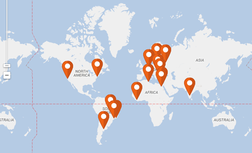
If you want to make a map, you don’t have to provide an exact address. Just put in the city, state or country location and it will automatically be plotted onto the map. You can also import images in the form of URLs and create galleries out of your images. There are many different ways you can tag and/or customize your data, but you can check out tutorials on the nitty gritty details here.
Salkever does suggest cleaning up your spreadsheet before you upload it so your web page of data is clean to work with from the start, but Silk does control for any duplicates in your data if there are multiple pages that look the same, and will prompt you to clarify your data.
Though IJNet doesn’t usually feature data-heavy posts, we’ve found a number of uses for Silk. We used it to engage with our readers in the post What news organization IJNet readers turned to in 2014 by adding each new entry received on social media to a Silk map. We used Silk’s grid feature to make a collage for our Advice from 6 journalists to guide you into the new year post. And in the tutorial below, you can see step-by-step how we created a Silk to plot our journalists of the month on a map, along with their top advice.
Take a look and try creating a Silk of your own:
![]() IJNet Managing Editor Margaret Looney writes about the latest media trends, reporting tools and journalism resources on the International Journalists’ Network’s site, IJNet.org, where this post originally appeared. IJNet helps professional, citizen and aspiring journalists find training, improve their skills and make connections. IJNet is produced by the International Center for Journalists in seven languages—Arabic, Chinese, English, Persian, Portuguese, Russian and Spanish — with a global team of professional editors. Subscribe to IJNet’s free, weekly newsletter. You can also follow IJNet on Twitter or like IJNet on Facebook.
IJNet Managing Editor Margaret Looney writes about the latest media trends, reporting tools and journalism resources on the International Journalists’ Network’s site, IJNet.org, where this post originally appeared. IJNet helps professional, citizen and aspiring journalists find training, improve their skills and make connections. IJNet is produced by the International Center for Journalists in seven languages—Arabic, Chinese, English, Persian, Portuguese, Russian and Spanish — with a global team of professional editors. Subscribe to IJNet’s free, weekly newsletter. You can also follow IJNet on Twitter or like IJNet on Facebook.
