As big data becomes more prevalent, more journalists are sifting through data as part of their reporting. In lean newsrooms without graphics specialists on staff, reporters often have to visualize the data themselves in order to share findings with the audience.
These non-specialists don’t always have the time or the expertise to consider the design elements of their visualizations. But some design choices warrant special attention as they can unintentionally color the message. Here is a checklist of questions to help you make sure your visualization does, in fact, say what you think it says.
Are preattentive attributes at play?
Before you can effectively visualize data, you first have to understand the preattentive attributes of visual perception, according to Jeffrey Shaffer, who teaches data visualization at the University of Cincinnati.
These attributes — visual qualities like color, size and position — determine what draws our eyes when we look at something new.
“They’re really the fundamental building blocks,” Shaffer said. “Anything you create in a chart type that is representing data in a graphical form is, in some form, using preattentive attributes.”

And some of the attributes have a stronger effect on our brains. Position, for example, is the dominant attribute, followed by color and size.
“We’re just better at certain things. Our minds are just wired that way,” said Shaffer.

Here’s an example of the attributes at work. In the image below, it’s hard to spot and quantify all the circles at first glance.
![xPBS_Shapes-01[1]](https://i2.wp.com/mediashift.org/wp-content/uploads/2016/02/xPBS_Shapes-011.png)
But once we group the same shapes together, the task becomes much easier.
![xPBS_Shapes-02[1]](https://i0.wp.com/mediashift.org/wp-content/uploads/2016/02/xPBS_Shapes-021.png)
We can even go a step further to introduce another attribute — color — to help amplify the effect.
![xPBS_Shapes-03[1]](https://i1.wp.com/mediashift.org/wp-content/uploads/2016/02/xPBS_Shapes-031.png)
Because preattentive attributes are so attention-grabbing, they need to be used purposefully and thoughtfully lest they lead the audience astray.
Does the chart type fit the data?
Make sure your data, not your aesthetic preferences, drive your chart choice.
Shaffer said he often sees people choosing a chart type “based on what they think looks good rather than what would best represent the data.”
The right chart type depends on the type of analysis. For example, a line chart is useful for showing how something changed over time. A bar chart makes it easy to compare different values. If you don’t yet have a high-level understanding of the various chart types, refer to a guide, like this graph selection matrix by visualization expert Stephen Few.
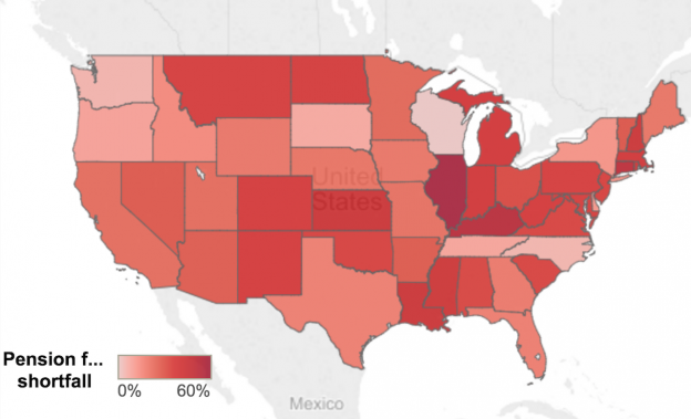
Did you use color correctly?
Misuse of color is one of the most common mistakes Shaffer sees in data visualizations. The data, not personal favorites or brand templates, should drive the use of color, said Shaffer.
“Generally, in data visualizations, you’re going to use color in one of three ways: sequential, diverging, or categorical,” Shaffer said.
Sequential colors are used to show values ordered from low to high (zero to 100, for example).

Click to visit the full, interactive visualization. Credit: CNBC
Divergent colors are used to show ordered values that have a critical midpoint, like an average or zero.

Click to visit the full, interactive visualization. Credit: Shine Pulikathara
And categorical colors are used to distinguish data that falls into distinct groups.

Click to visit the full, interactive visualization. Credit: The Pew Charitable Trusts
Shaffer said he often sees these color schemes misused, with sequential colors being used to compare apples and oranges, for example. And that matters because when we see sequential colors, we tend to quantify them on a sequential scale. Our brains interpret each color scheme differently.
Did you highlight the right things?
Data is often dense, which is why we visualize it to make insights easier to spot. But trying to show too much can overcrowd your insights.
“If you stack your data with 10 or 12 or 15 categories in the bar, it’s not going to be useful to anybody. There’s no way they’re going to be able to make a comparison of one to the next,” Shaffer said.

Even with just six categories, comparison gets more complicated. Can you tell how the purple category stacks up across countries, for example?
And make sure you’re not unintentionally highlighting unimportant things. Don’t use bright colors to represent things that shouldn’t dominate the reader’s attention, for example.
Conversely, if you don’t add any highlights, the reader’s eyes might glaze right over the whole chart, says Cole Nussbaumer Knaflic, author of “Storytelling with Data: A Data Visualization Guide for Business Professionals.”
To get this right, Knaflic suggests the “Where are your eyes drawn?” test.
“Look away or close your eyes. Then look at the visual you’ve created, taking note of where your eyes are drawn first,” she said.
Try it with this example from Knaflic. Where are your eyes drawn?

Credit: Cole Nussbaumer Knaflic
“If you’re like me, your eyes are pulled everywhere and yet directed nowhere all at the same time,” Knaflic said. “There are no clear visual signals indicating where we should focus our attention. We are not using preattentive attributes strategically.”
It’s hard to make sense of this chart. We have to look back and forth between columns and values to make comparisons, said Knaflic. And even with patience, it’s impossible to get a full sense of the data since some of the shapes overlap each other.
Now try the same test with this example, which shows the same data.

Credit: Cole Nussbaumer Knaflic
“We’ve given thought to where we want to direct our audience’s attention and used preattentive attributes (color and position) to make that visually clear,” said Knaflic.
Those attributes immediately bring two things to our attention. The blue bars make it easy to see how the business is performing across categories. The bars also show how the business stacks up against its competitors in each category.
“Where are your eyes drawn in the latter graph? Exactly where I want them to be,” said Knaflic. “That is the power of preattentive attributes used well.”
Did you offer context/instructions?
There are two types of visualizations: exploratory and explanatory, said Shaffer.
With exploratory charts, navigation becomes key, Shaffer said. Give readers the tools they need to explore the data and ask their own questions. Offer little indicators like “hover for details” or “click here to interact” to help them along.

Click to visit the full, interactive visualization. Credit: Brit Cava
Explanatory charts offer a guided story. Make sure the reader can immediately grasp what they’re looking at. Annotations like a clear title and labels can go a long way, said Shaffer.

Click to visit the full, interactive visualization. Credit: Nelson Davis
Final litmus test: What’s the first question?
Once you’ve made your visualization, it’s time for a pulse check. Share your work with someone else. What’s the first question you get?
“Do the questions you get deal with the insights that you’re highlighting or with how to read your visualization?” Shaffer said.
If the first questions deal with how to read the visualization, Shaffer said, “then I think the visualization sort of failed.”
Conversely, if the questions deal with the topic at hand, then the visualization is a success, Shaffer said.
“They’re engaged and they want to dive deeper into the data,” he said.
Martha Kang is the editorial manager of Tableau Software where she helps chronicle today’s big data revolution. A lifelong storyteller, she’s currently focused on telling data-driven stories that help us better understand our world, and ultimately, ourselves. Prior to joining Tableau, Martha worked as a journalist, first in TV news then in new media. She most recently served as the online managing editor of KPLU, an NPR affiliate in Seattle. There, she oversaw a number of projects, including the launch of Quirksee.org, a vertical site that featured two of her own award-winning stories, as well as a five-part, data-driven series, on Washington state’s idiosyncratic tax system.Martha has also worked at KOMO News, Northwest Cable News, and WLS-TV. In 2013, she was chosen as a Kiplinger fellow of public affairs journalism by Ohio State University.
