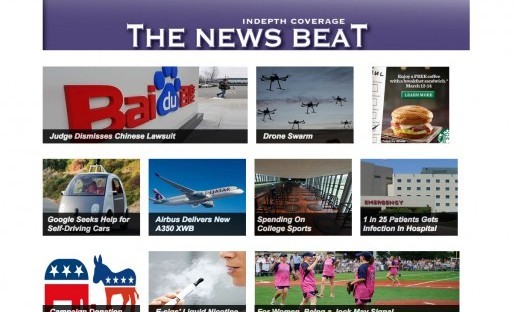
“The home page is dead.” We’ve heard that phrase a lot the last couple years, especially after it was reported that traffic to the New York Times’ home page had decreased by more than 50 percent over two years. In his response, Vox’s Ezra Klein said that the home page wasn’t dead, but it was changing: “The home page used to be the way most of your readers found your content. It’s becoming the way your power users find the content to share with your casual users.”
Actually, the home page can be valuable real estate. At a Nieman Foundation event earlier this year, Quartz publisher Jay Lauf, whose publication was one of the first to declare the death of the home page, said, “… Even if 11 percent of our audience … is on the home page, that’s something like one million or so people who are going to the home page on a regular basis.” And in late August, the Washington Post rolled out their new home page, complete with a more dynamic and flexible design. “The Post’s home page is a destination for many readers, and we wanted to create a page that lets them quickly see what the day’s big stories are and easily navigate to other top content on the site,” said Joey Marburger, director of digital products and design at the Post, in a news release.
We dare to take it one step further: Not only is the home page not dead, it is actually alive and well – and its design matters.
At the Engaging News Project, we recently conducted a series of three experiments to see what happens when people are given the same news content presented in different ways. More than 2,500 study participants browsed one of two websites: one with a classic, newsprint-like layout, or one with a contemporary, image-based layout (similar to the Washington Post’s new homepage). The same 20 evergreen articles, drawn from mainstream news media coverage, appeared on both sites.
Our results were striking.
Increase in Page Views

Page views increased by about 90 percent when study participants looked at the contemporary home page.
In all three of our experiments, we found that page views increased by at least 90 percent when participants viewed the contemporary home page compared to the classic home page.
When we looked at each of the 20 articles individually, we saw that nearly every article had more page views when it appeared on the contemporary website compared to the classic website.
Greater Recall
After browsing either the classic or contemporary website, study participants were asked to write down up to 10 articles that they could remember from the site. Afterward, they were asked to write down all of the details that they could recall about the first two (in study 1) or three (studies 2 and 3) articles that they mentioned. We determined how many of the details they recalled came from the home page and how many came from the full text of an article from the site.
We found that recall of details, although low for all participants, nonetheless increased by at least 50 percent when participants viewed the contemporary home page compared to the classic home page.
People Prefer Contemporary
Our research provided evidence that people prefer a contemporary home page. We asked study participants to indicate how enjoyable, informative, credible, trustworthy, interesting, clear, and easy to navigate they found the site. In two of our studies, participants rated the contemporary site more positively than the classic site. (In a third study, the difference in how participants felt about the sites was not statistically significant).
Other findings from our experiments can be found on our website.
Takeaways
So what do all these findings mean exactly? For starters, we think it demonstrates that how information is presented on a home page has a real effect on site visitors. It also shows that it is worthwhile for news organizations to devote some resources to their home page, to ensure they’re putting out the best product possible. For outlets considering a redesign, perhaps our findings will inspire them to test out a more contemporary design.
We know, of course, that a home page redesign is no small matter for a news organization. In addition to the expense, organizations must carefully consider how to best introduce the change to their audience; some examples include the Guardian’s iterations, the Daily Beast’s open letter, and The New York Times’ response to readers. What our research adds is a starting point for how one might redesign a news home page and a research method that could help to reveal whether a redesign will have a desired effect.
We do want to note that our findings came from mock news sites, created and tested in a lab setting. However, as we just mentioned, we think this type of research is a great starting point to continue looking at the impact news presentation has on audience learning.
We would love to hear from news organizations about what design elements on their home pages have worked for them. Our hope is that our findings, as well as future studies and collaborations, will bolster news organizations interested in testing innovative web design ideas.
Katie Steiner is the Communication Associate for the Engaging News Project, based at the Annette Strauss Institute for Civic Life at the University of Texas at Austin. Follow the Engaging News Project on Twitter at @engagingnews.


