This piece was initially published on Storybench, a cookbook for digital storytelling. Storybench is a collaboration between Northeastern University’s Media Innovation program, a new graduate degree in digital journalism, and Esquire magazine.
Baltimore broke out into riots and looting in April following the funeral of 25-year-old Freddie Gray. In an effort to better describe the racial inequities in life expectancy, education and policing among blacks in American inner cities, news organizations across the country visualized data. The graphics help contextualize the demonstrations.
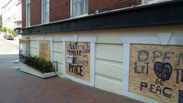
A portrait of Freddie Gray’s neighborhood of Sandtown, a region of Baltimore that has been depressed for decades. The New York Times sheds light on the environment Gray was living in by highlighting the amount of boarded-up or vacant homes in Sandtown. The paper also interviewed local residents.

“Police whiter than those they serve” was a visualization made by the Center for Public Integrity using Census Bureau statistics. The racial divide in police and residents is visualized for New York, Houston, Baltimore, Phoenix, Jacksonville, Memphis, Charlotte and many other cities.

The New York Times looked at the race gap between residents and police in several American cities. The paper underscores the racial chasm between the police and the policed in New York, Baltimore, Charleston and Cleveland, cities that have all seen the use of excessive force in recent months.

Life inequality in Baltimore’s neighborhoods by the Washington Post. The paper’s Wonk Blog assessed the quality of life in 15 of the city’s neighborhoods and then charted them against countries around the world.

“Baltimore in not an outlier” is an effective scatter plot put together by Five Thirty Eight to illustrate how the inequalities that sparked the demonstrations are common across the country.

Where Baltimore’s police officers live, by Five Thirty Eight, shows how the police and the policed in Baltimore for the most part live in different places. Perhaps this means they’re inherently different people.

The Dallas Morning News looked at population by race in different U.S. states using squares to represent states. It’s an interesting visualization motif in that it equalizes them in terms of size for the purpose of this comparison. It also has a periodic table of elements look. So the East Coast states are the noble gases?

Have some visualizations you’d like to add? Comment below or tweet us at @storybench.
Aleszu Bajak is a journalist covering science, energy, the environment, and health across the Americas. He’s the founder and editor of LatinAmericanScience.org, a resource for science news out of Latin America. In 2013 he was awarded a Knight Science Journalism Fellowship at M.I.T., where he explored the interface between journalists, designers and developers. He now teaches journalism at Northeastern University’s Media Innovation program and edits Storybench.org, an under-the-hood guide to digital storytelling. Before freelance reporting from Latin America, he worked as a producer for the NPR talk show Science Friday. He writes for Nature, Science, New Scientist, and SciDevNet, among other outlets.

This piece was initially published on Storybench, a cookbook for digital storytelling. Storybench is a collaboration between Northeastern University’s Media Innovation program, a new graduate degree in digital journalism, and Esquire magazine. Storybench provides an “under the hood” look at the latest and most inventive examples of digital creativity and the tools and innovation behind them. Follow Storybench on Twitter and Facebook.
