It’s a common problem whenever you teach a visual course — how do you instill the idea of visual variety?
Here at the University of Georgia’s Grady College of Journalism and Mass Communication, I’ve introduced a photo assignment that the kids call the Dr. Seuss Assignment with the goal of helping them find different ways of seeing.
Years ago, my major professor at Syracuse University’s S.I. Newhouse School of Public Communication had drilled into us seven types of images found in major photo essays — Overall, Long, Medium, Close-up, Detail, Portrait and Fringe. As much as I hate formulas, when I got stuck as a shooter, I turned back to Prof. David Sutherland’s list, and it got me out of trouble.
Many of us who teach introductory photojournalism or video journalism courses have used a simpler version of this — a three-photo package consisting of a long shot, a medium shot and a close-up shot. It gives you some basic variety, allows you to build a sequence, but fairly often the content of the images was redundant. A student would shoot wide, zoom in and have the same angle but tighter for the next two shots. No movement, no narrative.
Faces and Places
This idea came about while I was sitting at the Atlanta Photojournalism Seminar two years ago listening to the Washington Post’s Michael Williamson talk about his work. He was showing images from the 2008 presidential campaign, images from parts of the country struggling with the idea of Barack Obama at the top of the ticket. The struggle for him, Williamson said, was how do you start to show a story like that?
As he walked through his process, the following flowed into my notebook:
- A place
- A face
- A place with faces
- Faces in places
It was a narrative-driven formula for visual variety, as opposed to the compositional one I’d taught for years.
The first photo establishes the place, much like a traditional overall or long shot would. What does this place look like? What’s its color? Its texture? Its geography? Its architecture?
The second photo moves in really right, just down to a face that represents who lives, works or exists here. What do they look like? How does the place show in their face?
Next you move back out, going back to the place but filling it with faces now. How to the faces use the space? How full or empty is it? How do the faces move through the space?
Lastly, the focus comes back to the face and how the individuals interact with the place, tying it all together.
How It’s Worked for Students
As I went back and looked at Williamson’s stories in the Post, I saw the pattern appear again and again. Not always sequenced in the same order, but this visual narrative was there. And it has worked for my students, as well.
In January 2014, Brenna Beech took a look at a monastery in Conyers, Georgia. Her opening image shows the exterior of the main building. Next, she moves to one of the brothers working inside the place. From there, to the inside of the main chapel, bathed in light and the monks in prayer. From there, it’s back outside to the men proceeding out of the chapel, deep in thought.
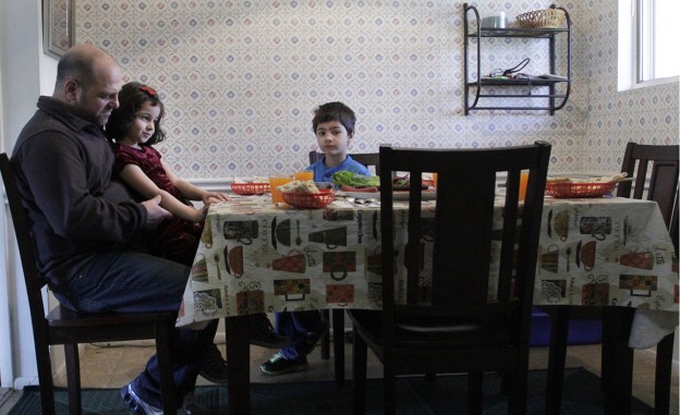
A year earlier, Lyric Lewin looked at an apartment complex with a growing Muslim community. Her opening image gave us the wide open place, looking like any other complex. Moving in much closer gave us the joyous face of one of the kids in the neighborhood. Next comes a shot through a partially opened doorway, tying the residents of unit two to the physical place. Lastly comes the evening meal, with the family gathered at the table and light pouring in from a high window.

Former UGA student and current CNN.com photo editor Lyric Lewin’s look at an apartment complex in Georgia.
How to Incorporate
I have been using this as the warm-up assignment for our Documentary Photography class. All of the students have gone through at least one, some two, photojournalism courses already, so I use this to knock some dust off and challenge them to start seeing again but seeing in a narrative way. This fall, I’m pulling the assignment back to my Introduction to Photojournalism course, as it has proven itself as a viable way to learn to see.
Anyone teaching a multimedia course and trying to prompt students to think visually could use this approach. And if you’re teaching a video course, you could easily collect examples by showing a video and then showing frame grabs of each of the different types of shots. We all have different expertise. But by sharing and remixing — and digging into the work of people like Williamson — we can open up new ways for students to see the communities and people we cover.
Mark E. Johnson is the senior lecturer of photojournalism at the University of Georgia’s Grady College of Journalism and Mass Communication, still shoots a photo every day and comments on visual journalism at VisualJournalism.info. Follow him @markejohnson.


