Over the last few months, I’ve been working on a standard website design to bundle with The State Decoded. That’s the project funded by the John S. and James L. Knight Foundation to create a standard, installable platform to display laws online. The project started as a Virginia-only site, for which I had originally created a very “Virginia” look, but the expanded scope of project presented some specific challenges:
- The design needed to be flexible and work on everything from a killer 27” desktop display down to a 320-pixel-wide mobile device.
- There was a marketing and general information side of the site, in addition to the pages that actually display laws.
- The layout and design needed to work for all 50 states and, potentially, other government entities at the national or local level.
I got to work.
Sketching
Coming from an architecture background, putting pen to paper is typically the fastest way for me to get an idea out. It removes things that would distract from the base form, things like typefaces, color, specific language, photo selection, etc. That way I can focus on the underlying organization. The result of that sketching looked like this:

Mockups
After my initial sketches, I mocked up the design in Photoshop. This is where I did the color, font selection, and so forth. In setting this up, however, I made sure that we minimized the use of images in the layout (the only image that’s part of the basic site design is a simulated state seal graphic) and laid out the page with a mind toward executing the design in HTML.

After the initial desktop layout, I moved onto the 320-pixel-wide iPhone design. This was the extreme end of screen size that we’d need to tackle, and it presented other design concerns that don’t show up on the desktop. How large do the links need to be for a fingertip? How do we handle hover events in the mobile setting? (Since when using a fingertip instead of a mouse, there’s no such thing as “hovering.“) How, in short, can users do everything on a mobile device that they can do on the desktop?
Having defined the two extreme layouts of desktop and phone, I was able to work up a tablet layout that addressed narrower widths (around 720 pixels), but that allowed for a more complex layout than the much smaller handheld devices.
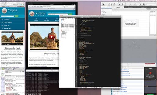
Build
When I started actually producing HTML, I looked at how to provide flexibility in the design, to make it easy for people setting up The State Decoded to deploy custom color schemes without having to do a lot of fussy editing of disparate settings. The tool I chose for the job is called Sass (aka SCSS). It’s a series of functions — its own language, in a way — for working with Cascading Style Sheets dynamically. This way I can define a series of variables, and build the site’s design using those variables.
For example, instead of defining two similar shades of blue (one to define the blue background in the header and a darker blue in the navigation), we define just one shade, and then use a little math to set the second color as a darker version of the first one. Somebody setting up a State Decoded-powered site can change the first color — the second color will change accordingly.
Responsive styles
The second part of the process of creating the HTML was using CSS3’s @media queries to provide a client-side solution to device rendering. The same HTML markup is laid out based on a series of conditions, which are defined in the stylesheets. Anytime in our SCSS when there is a responds-to(device) (when the device is a smartphone or tablet), that’s an accommodation for the particulars of the device in question. The site flexes between these predefined breakpoints using a technique called “Responsive Design.” It was popularized by Ethan Marcotte and is described in detail in his book of the same name, published by A Book Apart. This allows the site to look its best at all sizes.
Next steps
Now that the basic page design is done, the project is moving onto laying out the actual text of the laws. This is really the heart of the site and, since laws are really just text, that design is really all about typography. Every legal code has its own quirks and markup styles, and all of those must be accommodated. That process will be similar, and you can follow along on the GitHub project for the user interface.
John Athayde is a UI/UX/Design type who comes from an architecture (of the building variety) background. He started in print design with pica sheets and crop rulers and moved into web in the 90s. He’s been active in the Ruby on Rails community since 2006 and has broad experience in e-commerce and running creative teams. He co-authored “The Rails View”, a book about improving view layer code for Ruby on Rails developers, in 2012. He is currently leading the design and view development on Internal Tools at LivingSocial. Prior to LivingSocial he was the Design guy at InfoEther and ran Hyphenated People, a UI/UX Consultancy with Amy Hoy. He also runs Meticulous, a design and film company, in his free time.