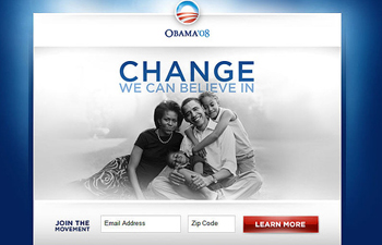
A political campaign website is the place where candidates recruit new volunteers, and where the candidate can get their message out unfiltered. It’s more important than ever, and yet many candidates still struggle to get it right.
“The website really is that first real encounter with the voter; it’s your chance to turn a casual visitor into an actual supporter,” said Colin Delany, founder and chief editor of Epolitics.com.
A good website will get visitors to take action in some way. Often, one of the best small victories for a candidate is to get people to provide an email address for future contact. Email is like the gateway drug for a politician’s campaign website, getting people involved one click at a time.
But that’s just the beginning. Getting the basics right requires a dedication to making the simple things work for average folks.
Inspire Action
Joe Rospars, a founding partner of Blue State Digital and the new media director for Barack Obama’s 2008 campaign, said that a politician’s website should make it as easy as possible for someone to figure out how they can help the candidate by either giving time, money or passing along information from the campaign site to friends.

“At a technical level, when there are too many clicks to get to the thing you want people to do and they want to do, that’s a waste of their time and a missed opportunity,” Rospars said.
Rospars also said a campaign needs to ask if the website is a true reflection of their offline operations. For national candidates, they must determine if the website offers opportunities to engage at the local, statewide and national levels. Is it the heartbeat of the campaign in terms of the latest news, information, organizational efforts and events that are going on?
Of course, a campaign website has to have good content. Delany said this content has to help persuade a potential supporter. At the same time, a website and online presence can’t have so much going on, and be so complicated that a small team — or the candidate herself — can’t keep everything updated.
“You want to reach people through the channels that they use,” Daleny said, “but if you are out on 20 different social networks, you don’t have time to maintain any of them well. You don’t want to build any more than you can maintain.”
Examples of Good and Bad
Daleny pointed to the re-election website of Sen. Harry Reid and the campaign site of Sean Duffy, who is running for Congress in Wisconsin’s seventh district, as exceptional candidate websites. He noted that while the layouts are different, it’s easy to find buttons for getting involved and where to find out more about the candidates. Additionally, Daleny suggested that Reid’s emphasis on Nevada’s landscape is something that might draw positive attention to his unpopular candidacy with something that constituents care for, while Duffy’s emphasis is on him as a candidate.
In contrast, New York State Attorney General Andrew Cuomo’s campaign site for his run for governor seems to have been inspired by BarackObama.com, according to Delany. But, he said, “it’s so cluttered that it’s almost an assault on the eyes…very hard to pick out the information you’re actually looking for.”
A website played an important role in the victory of Senator Scott Brown during Massachusetts’ special election in January 2010. Robert Willington, a web and political strategist for the Brown campaign and executive director of RebuildTheParty.com, said the campaign website should act as a “hub” for what’s happening at campaign headquarters and with the candidate.
“It’s like the center part of the wheel that connects everything else,” Willington said. He said the Brown campaign often used social media like Twitter to drive people to the site.
Tim Hysom works as the director for communications and technology services at the Congressional Management Foundation. He has also worked on the CMF’s Gold Mouse Report, which recognizes the best websites on Capitol Hill. Hysom said a good candidate’s website acts as a kind of virtual office.
“The website should be a place where every kind of information that the [actual] office could provide…is available to the greatest extent possible,” he said.
Two examples of sites that do it right are the winners of the CMF’s top award, the Platinum Mouse Award. Last year those were Sen. Lisa Murkowski of Alaska and Rep. Steve Israel from New York.
One thing that all good campaign websites have in common is that they get to the point quickly and do a good job of capturing a user’s interest.
“At the end of the day what many people will give you is their first couple of seconds on the site,” Rospars said. “If you don’t make clear that they are important or that there are real opportunities to get involved and that it will be a meaningful thing for them, they are gone.”
Steven Davy is the web content editor at The World, a BBC,WGBH,PRI co-production. He is also the developer of Exploring Conversations, a multimedia website examining the language of music. He is the politics correspondent for MediaShift.

