The MediaShift Innovation Spotlight looks in-depth at one great mash-up, database, mapping project or multimedia story that combines technology and journalism in useful ways. These projects can be at major newspaper or broadcast sites, or independent news sites or blogs.
What It Is
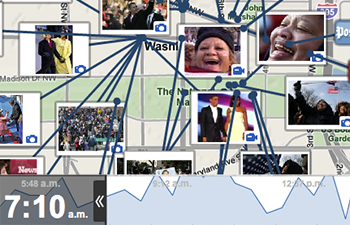
TimeSpace, a Washington Post project, is a coverage mapping framework that displays content from multiple sources in space (via a map) and time (via a timeline). A display map, covering anything from a single city block to the world, is tagged to show viewers where news is being covered. Viewers can also view the news map as it appeared at different points over the preceding hours or days, giving them a picture of how the news events unfolded over time.
Why It’s Innovative
TimeSpace provides a unique browsing experience. Zoom in and out on a map to see what news is being covered where. Slide the timeline around to see what’s going on when. It’s like a news time machine.
The brilliance of TimeSpace is that it is not just one project. It was built as a framework, so that different maps could be created to cover different topics. There are already multiple versions out: TimeSpace Election, TimeSpace World and TimeSpace Inaguration.
How They Did It
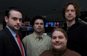
The team responsible for TimeSpace are known as the “web ninjas” at the Post: editor of innovations Steven King, developer Dan Berko, interface developer Jesse Foltz, and designer Chris Buddie.
TimeSpace started out as a tracking tool for the candidates during the recent presidential election. As the project evolved, pulling in all election-related media, they changed direction and built the framework.
“I had the idea to develop a map and dated timeline that traced the candidates across the country during the final weeks of the presidential campaign and on election day. Those first sketches are far from what we have today,” King said. “That does much more than just trace a few people around the country; now we can trace and plot news anywhere in the world.”
TimeSpace is built in Flash, using a special cluster technology that Foltz adjusted to keep the content from overlapping too much. Buddie helped the team fine-tune the user interface.

The content is pulled in largely through RSS feeds. Each item is parsed to extract relevant fields and geocoded using Google’s API. This simple process means that “a new version can be up in a few hours, once they’ve identified the necessary feeds,” said Berko.
Of course, each version is a little different. TimeSpace World was upgraded with better time and location plotting, and sharable links to specific views inside of TimeSpace and an embeddable widget.
King wrote about the Inauguration version on his blog:
For the Inauguration version we strategically placed 35 photographers and videographers throughout the mall and the parade route in order to provide a complete experience to those who could not attend the historic event. In order to cover the city in this way we drafted a small army of multimedia journalists from the University of North Carolina. The students and Post photographers were equipped with Canon and/or Sony HDVideo cameras, MacBooks or eeePC’s (based on security size restrictions), ATP Photologger GPS units (not recommended), and Sprint USB Sierra Wireless broadband USB cards (TimeSpace is sponsored by Sprint).
Next on the list for a TimeSpace map is a history of the television show, “Lost.” The team is excited about using the framework for something less serious.
Screencast
The web ninjas were kind enough to send me some drawings and screenshots of TimeSpace in development. You can see how the project evolved into what it is today.
Please let me know of any innovative projects you are working on or have seen lately. It doesn’t have to be from a major newspaper, it just has to be an innovative blend of journalism and technology. Please e-mail me at mtaylor[at]megantaylor[dot]org to submit a Spotlight recommendation.


Cool. What’s the point? Shades of Rob Curley!
meh, i’ll give you a web ninja..