I’ve got a problem: I hate using the Internet — on my phone, that is. I am one of those people whose ears perked up at the idea of being able to take my online activities, such as reading news, watching videos and social networking with me wherever I go, on my phone. And after investing in a flashy smartphone to do that — the Treo 680 with AT&T as my carrier — I’m quite unhappy with the way things have worked out.
Accessing content on a mobile device — from news to social networking — is an exercise in frustration. I’ve now realized that it wasn’t really about how many bells and whistles these devices have but how hard media and social media companies make it on us to actually use their sites on the phones.
The mobile Internet has been around, in some form or another, for nearly 10 years now. And while the Internet has changed immensely in this time, both in the type of content and speed of connection, the mobile web has lagged far behind. If getting email on a cell phone is a challenge, visiting relatively standard content sites — even the ones supposedly optimized for mobile devices — can be a nightmare.
News Sites: Waiting and Wanting
As a person interested in reading news quickly, I find that experience to be a real hassle on my smartphone. I purchased one of these phones specifically because I wanted to access website content that’s hard to view on a regular cell phone. While many news sites offer mobile versions, only a handful are accessible to me — and by accessible I mean they are easy enough to use that I won’t give up after just a minute or so.
If you’ve got too much time on your hands and want to read the news on your phone, I recommend CNN.com’s mobile site. On my device and with my service provider, it takes the homepage nearly 8 minutes to load. I personally can’t wait that long for news; whatever it was I might have been interested in finding out about, when faced with this wait, now seems unimportant.

And CNN isn’t alone: I’m a big fan of the BBC website, but its mobile site — in spite of the fact that the UK is so much ahead of the U.S. in providing mobile content — is just as bad. Upon entry into the BBC’s mobile portal, the question that comes to mind is “Is this it?” A series of rudimentary blue links fill the screen. Click on one of them — say, Top Stories — and it gets cumbersome. More blue links, but these are so close together it’s easy to tap the wrong thing. Want to see that great AP photo larger than a thumbnail? You’re going to have to download it. Now why would I want an image of a roadside bomb on my cell phone? Another strike.
One of the better of the worst is the New York Times mobile site. While other media companies try to make their mobile sites exact clones of the original — and therefore too difficult to use because they take too long to load the graphics — the Times site works to some extent because you can easily see the top headlines on the first screen, as you would on the front page of the paper. Once you choose a story to read, the interface makes it pretty easy to follow along with the article, view the photos associated with it, and move to the subsequent pages. After that, however, it’s a real pain to get back to the beginning of the section and browse, and I end up having to return to the homepage to get my bearings again. Conclusion: I won’t be reading the New York Times on my phone either.
Social Media Goes Mobile…Kind Of
Call me crazy, but I think being social should mean that you aren’t tied to your computer to do it. People move around, so I should be able to do some social networking when I’m mobile, but I can’t (outside of simple micro-blogging with Twitter).

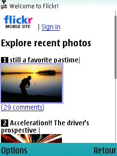
One the big selling points of the phone I purchased, the Treo 680, was the ability to use photo-sharing sites like Flickr easily. The relentless ad campaign boasting this feature eventually hooked me, but I was quickly disappointed. Instead of a rich mobile experience what I got was a lame link-based look and feel with tiny photos. The photos on Flickr are the experience, so if you can’t see them, what’s the point? Even worse, each time I click on a link, such as “Recent comments on your photos,” the system logs me out. I log back in, and try again, and again it logs me out. Guess what? I’m done. My mobile photo-sharing experience lasted approximately one day, after which I just gave up.
Another failed mobile experience was a recent visit to YouTube, which recently launched a new and improved mobile site. I tried to watch a minute-long video, and after 10 minutes of “buffering” had passed, I was through. Not because I was impatient, but because the connection had mysteriously “closed.” And if you don’t have an unlimited data plan, forget it. Even YouTube urges you to get one, lest you be in for major shock when your bill comes.
iPhone: The Answer to Our Prayers?
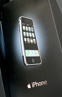
As the dust settles after the glitzy launch of Apple’s new iPhone and the general public takes note of the advantages and shortcomings of the revolutionary gadget, it also becomes glaringly obvious that one of the reasons why the iPhone was seen as such a “savior” is because traditional phones are just bad for consuming content.

Last week I had a chance to briefly test the iPhone, and I must say, as a gadget and a centralized mobile place for all of your digital “stuff,” it’s quite impressive. As far as accessing mobile content, I was more than satisfied with the way the iPhone handled viewing news sites that regular phones bungled. Apple’s commercials tap into our frustrations of viewing news content, highlighting the ease of reading the New York Times in the TV ads. When I first saw the ad I doubted it, but the fact is the iPhone works just as it does on the commercials.
By most accounts the device is living up to its hype, and I’m hopeful it will deal other mobile phone makers a sharp kick in the pants so they might start making better devices in order to compete. I also hope that if users begin to see the ease of accessing “regular” websites — not watered-down mobile versions of those sites — on their iPhones, this will compel media companies to make their content more accessible to users by creating better mobile sites. That might be even more revolutionary than the “Jesus phone” itself.
Who’s to Blame?
So why is this so hard? I’m surely not the only one who has felt this level of frustration. With about 70 million smartphones sold last year and even more regular cell phones boasting the ability to access the web, I’m guessing I’ve got more than a few brothers-in-arms in this battle. The question that bugs me the most is why media companies aren’t quicker to rectify this problem. Surely they have something to gain by making our lives easier; if nothing else, they would gain loyalty to their brands for not making us cringe when we hear the word “mobile” after their names.
And is this all their fault? Is there something that manufacturers can do — something innovative like what Apple has done — to make getting mobile content easier? My guess is that the problems I’ve experienced are a combination of badly designed mobile sites, a less-than-perfect data connection from my carrier, and the pre-installed software I am using for browsing. I think all parties — carriers, media companies and phone manufacturers — can bear part of the blame, but in general they could greatly improve their respective products by making ease of use the No. 1 priority.
Even though my experience with accessing mobile content has been highly frustrating, I’m not giving up yet. I’m far too committed to the idea of being able to know about breaking news as it happens and connect to social media sites while on the go. As things stand now, I think I’ll stick to using my not-so-smartphone for what it really does well: making phone calls.
What do you think? Has accessing news and social media content on your phone been easy or hard? Will the iPhone change things for the better? Is there more that media companies and manufacturers can do? Share your thoughts in the comments below.
Jennifer Woodard Maderazo is the associate editor of PBS MediaShift. She is a San Francisco-based writer, blogger and marketer, who covers Latino marketing at Latin-Know and Latino cultural issues at VivirLatino.
Photo of smartphone keypad by Amodiovalerio Verde.

I don’t know about the “social networking” sites I do my social networking in a Pub but I find that the news sites are generally good if you can find the right URL. For example, you are looking at the wrong BBC site.
Go to http://www.bbc.co.uk/mobile/news. You should see a page with thumbnails, headlines and snippets formatted for the Treo, at least I do.
What is certain is that when an MP3 player enjoys a 78 percent market share in the United States, a plethora of products and content spring up just to serve its users.
http://www.ipodconverter.com
What a retarded article. Install Opera Mini 4 to your Treo and download the normal, not-mobile BBC homepage faster than on the overhyped iPhone.
Try Opera Mini 4.0 beta
Sebhelyesfarku, please be civil.
I downloaded Opera Mini once. It’s a real memory hog. I am satisfied with the stripped-down Internet Explorer browser on my MotoQ. Probably the only time I’ll complement IE!
One way to get around the limitations of surfing is to use an online RSS reader. Much more user friendly than trolling sites on your cell phone.