It’s an election year, which means the numbers are often the story. But these stories tend to focus on updating the same few numbers—in particular, how many delegates each candidate has won, and how the candidates are polling with voters.
Of course, there’s much more to election coverage than just these figures. Think of all the ways people’s passions and emotions spill out in the lead-up to Election Day. Consider the shifts in beliefs and support, and the various ways these changes manifest.
Some of these forces at play can be examined through data. Here are a few types of data-driven election stories that even budding data journalists can tackle.
1. Contribution Data
With Bernie Sanders touting the power of $27, individual contributions have received special attention this election cycle.
The Federal Election Commission collects and releases downloadable contribution data by state. Explore the data, and you can see the average size of contributions in your area. You can also identify those few deep pockets that may be tipping the scale.
Another approach is to build a searchable interface that allows readers to explore the data for themselves. With interactivity, readers can find themselves in the data, perhaps by seeing whom their neighbors and colleagues support, which can make the large data set personally meaningful.

Click to visit the interactive version. Credit: Ben Jones.
2. Candidate-Spending Data
Donald Trump boasts that he has spent less on his campaign than his counterparts—but by how much? The FEC’s candidate-spending data holds the answer.
As of mid-May, the data showed Trump had spent $34 million compared to Hillary Clinton’s $127 million and Bernie Sanders’ $120 million. In addition to the running total, the FEC data also breaks down where all the money is going — by category and by state.

Click to visit the interactive version. Credit: Dash Davidson.
3. Social Media Data
As the New York Times made clear, Donald Trump has used Twitter to insult at least 223 different people, places and things. Data visualization expert Adam McCann took what the paper compiled and turned it into an interactive list.
The reader can filter by person by group, or even by word to see who Trump tweets about, and which types of insults he lodges when he talks about them.

Click to visit the interactive version. Credit: Adam McCann.
You can conduct a similar analysis of other candidates’ Twitter streams, filtering for various hot-button issues, word choice, and mentions of other candidates.
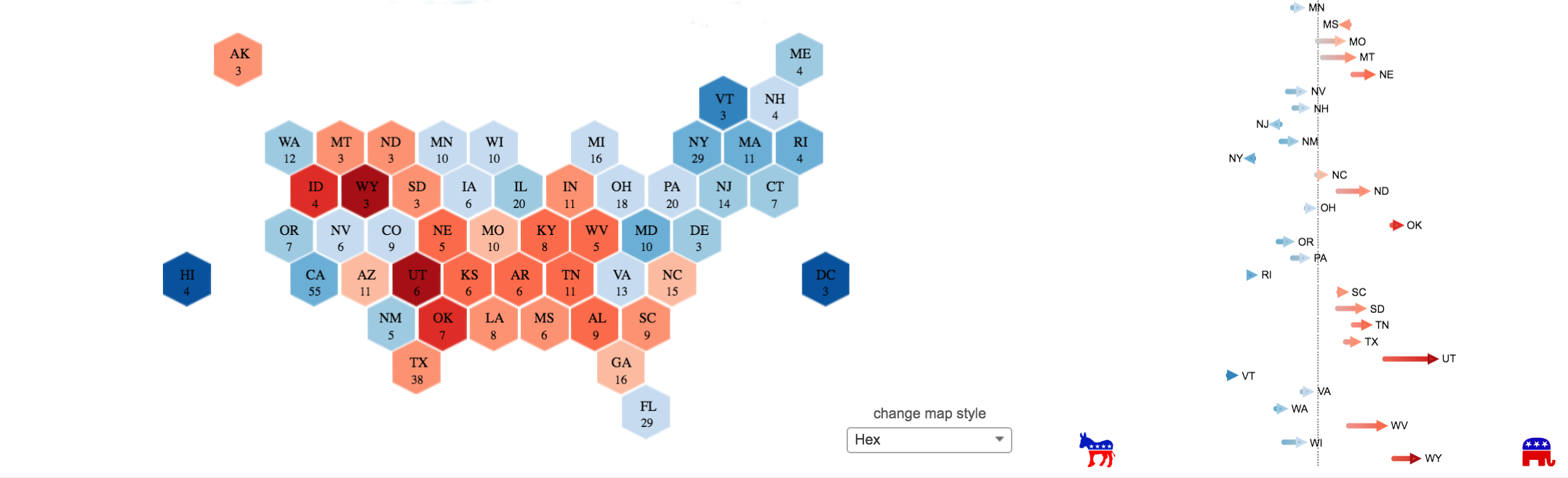
4. Historical Data
Consider looking back to look forward. Data from past elections show how states shifted from one election to the next.
You can highlight big shifts in the nation’s political climate. In 1988, for example, almost all states moved left by varying degrees. Or you might opt to highlight the smaller shifts, perhaps in the context of swing states. Florida, for instance, moved right in 2004, left in 2008, then right again in 2012.

Click to visit the interactive version. Credit: Jacob Olsufka.
5. Proxy Data
There are many more election stories for which there isn’t a downloadable data set. In some cases, proxy data can help tell those stories.
“We use proxy data all the time—so often that those of us who work with data or who work in politics never really think about it,” said Eva Galanes-Rosenbaum, media and public opinion analyst at ReThink Media.
Take the Whole Foods vs. Cracker Barrel test, for example. Whether your county has a Whole Foods or a Cracker Barrel is a proxy for socioeconomic status and a range of other demographic attributes, says Galanes-Rosenbaum.
“Wealthy liberals tend to shop based on their beliefs. Wealthy conservatives—they don’t tend to care whether their fish is wild-caught,” said Galanes-Rosenbaum.
This idea is similar to the Starbucks:Walmart ratio that Nate Silver used as part of his 2008 election predictions, Galanes-Rosenbaum said, though Starbucks cafés have become almost too pervasive since.
What Are Your Ideas?
Those are just a few ideas for data-driven election stories. What other election stories have you told with data? Share your ideas and experiences in the comments below.
Martha Kang is the editorial manager of Tableau Software where she helps chronicle today’s big data revolution. A lifelong storyteller, she’s currently focused on telling data-driven stories that help us better understand our world, and ultimately, ourselves. Prior to joining Tableau, Martha worked as a journalist, first in TV news then in new media. She most recently served as the online managing editor of KPLU, an NPR affiliate in Seattle. There, she oversaw a number of projects, including the launch of Quirksee.org, a vertical site that featured two of her own award-winning stories, as well as a five-part, data-driven series, on Washington state’s idiosyncratic tax system. Martha has also worked at KOMO News, Northwest Cable News, and WLS-TV. In 2013, she was chosen as a Kiplinger fellow of public affairs journalism by Ohio State University.

You might have mentioned the multitude of resources available from groups like opensecrets.org, sunlightfoundation.com and public integrity.org. They make a reported job much easier