There are some amazing algorithms coming out the computer science community which promise to revolutionize how journalists deal with large quantities of information. But building a tool that journalists can use to get stories done takes a lot more than algorithms. Closing this gap has been one of the most challenging and rewarding aspects of building Overview, and I really think we’ve learned something.
Overview is an open-source tool to help journalists sort through vast troves of documents obtained through open government programs, leaks, and Freedom of Information requests. Such document sets can include hundreds of thousands of pages, but you can’t find what you don’t know to search for. To solve this problem, Overview applies natural language processing algorithms to automatically sort documents according to topic and produce an explorable visualization of the complete contents of a document set.
I want to get into the process of going from algorithm to application here, because — somewhat to my surprise — I don’t think this process is widely understood. The computer science research community is going full speed ahead developing exciting new algorithms, but seems a bit disconnected from what it takes to get their work used. This is doubly disappointing, because understanding the needs of users often shows that you need a different algorithm.
The development of Overview is a story about text analysis algorithms applied to journalism, but the principles might apply to any sort of data analysis system. One definition says data science is the intersection of computer science, statistics, and subject matter expertise. This post is about connecting computer science with subject matter expertise.
The algorithmic honeymoon
In October 2010 I was working at the Associated Press on the recently released Iraq War Logs. AP reporters toiled for weeks with a search engine to find stories within these 391,832 documents. It was painful, and there had to be a better way.
Rather than deciding what to look for I wanted the computer to read the documents and tell me what was interesting. I had a hunch that classic techniques from information retrieval (TF-IDF and cosine similarity) might work here, so I hacked together a proof-of-concept visualization of one month of the Iraq War Logs data using Ruby and Gephi.
And it worked! By grouping similar documents together and coloring them by incident type we were able to see the broad structure of the war. It was immediately clear that most of the violence was between civilians, and we found clusters of events around tanker truck explosions, kidnappings, and specific battles.

A few months later we had a primitive interactive visualization. It was exciting to see the huge potential of text analysis in journalism! This was our algorithmic honeymoon, when the problems were clear and purely technical, and we took big steps with rapid iterations.
But that demo was all smoke and mirrors. It was the result of weeks of hacking at file formats and text processing and gluing systems together and there was no chance anyone but myself could ever run it. It was research code, the place where most visualization and natural language processing technology goes to die. No one attempted to do a story with the system because it wasn’t mature enough to try.
Worse, it wasn’t even clear how you would do a story starting from one of these visualizations. Yes, we could see patterns in the data, but what did those patterns mean and how would we turn them into a story? In retrospect, this uncertainty should have told us that despite our progress in algorithms, we didn’t yet understand the journalism part of the problem.
Getting real work done
The next step was a prototype tool, initially developed by Stephen Ingram at UBC and completed by the end of 2011. This version introduced the topic tree and its folders for the first time. And I had a document set: 4,500 pages of recently declassified reports concerning private security contractors in Iraq. Trying to do a story about these documents taught us a lot about the difference between an algorithm and an application.
The moment I began working with these documents — as a reporter, not a programmer — I discovered that it was stupendously important to have a smooth integrated document viewer. In retrospect it seems obvious that you’ll need to read a lot of documents while doing document mining, but it was easy to forget that sort of thing in the midst of talking about document vectors and topic modeling and fancy visualizations. I also found that I needed labels to show the size of each cluster, got frustrated at the overly complex tagging model, and implemented more intuitive panning and zooming in the scatterplot window. A few weeks of hacking eventually got me to a system I could use for reporting.

The final story included the results of this document set analysis, reporting from other document sources, and an interview with a State Department official. This was the first time we were able to articulate a reporting methodology: I explored the topic tree from left to right, investigating each cluster and tagging to mark what I’d learned, then followed up with other sources. The aim of the reporting process was to summarize and contextualize the content of a large number of documents. This was a huge step forward for Overview, because it connected the very abstract idea of “patterns in the data” to a finished story. We thought all document set reporting problems would take this form. We were wrong.
Just as the proof-of-concept was research code, the prototype was the kind of code you write on deadline to get the story done by any means necessary. The data journalism community often writes and releases code written for a single story. This is valuable because it demonstrates a technique and might even provide building blocks for future stories, but it’s usually not a finished tool that other people can easily use.
We learned this lesson vividly when we tried to get people to install the Overview prototype. Git clone, run a couple of shell scripts to load your documents, how hard could it be? It turned out to be very hard. At NICAR 2012 I led a room full of people through installing Overview and loading up a sample file. We had every type of problem: incompatible versions of git, Ruby, and Java; operating system differences; and lots of people who had never used a command line before. Of 20 people who tried, only 3 got the system working. We were beginning to make contact with our user community.
Usability trumps algorithm
We re-wrote Overview as a web application to solve our installation woes (largely the work of Jonas Karlsson and Adam Hooper). We also dropped the scatterplot visualization, the visualization that we had started with, because log data and user interviews showed no one was using it. We went all-in on the tree and had a deployed system by the end of 2012.

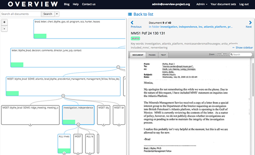
Do you understand what is happening in this screenshot? Is it clear to you that the window on the lower left is a list of documents, each represented a line of extracted keywords? It wasn’t obvious to our users either, and no one used this new system for many months.
We knew that Overview was useful, because we and others had done stories with the prototype. But we were now expecting new people to come in fresh and learn to use the system without our help. That wasn’t happening. So we did think-aloud usability testing to find out why. We immediately discovered a number of serious usability problems. People were having a hard time getting their documents into Overview. They didn’t understand the document list interface. They didn’t understand the tree.
We spent months overhauling the UI. We hired a designer and completely rebuilt the document list. And based on user feedback, we changed the clustering algorithm.
During the prototype phase we had developed a high-performance document clustering algorithm based on preferentially sampling the edges between highly similar documents and building connected components, documented in this technical report. We were very proud of it. But it tended to produce long lists of very small clusters, meaning that each folder in the tree could have hundreds of sub-folders. This was a terrible way to navigate through a tree.
So we replaced our fancy clustering with the classic k-means technique. We apply this recursively, splitting each folder into at most five sub-folders according to an adaptive algorithm.The resulting tree is not as faithful to the structure of the data as our original clustering algorithm, but that doesn’t matter. Overview’s visualization is for humans, not machines. The point is not to have a hyper-accurate representation of the data, but a representation that users are able to interpret and trust. For this reason, it was absolutely necessary to be able to explain how Overview’s clustering algorithm works for a non-technical audience.
What do journalists actually do with documents?
We solved our usability problems by the summer of 2013 and journalists began to use our system; we’ve had a great crop of completed stories in the last six months. And as we gained experience we finally began to understand what journalists actually do with a set of documents. We have seen four broad types of document-driven stories, and only one of them is the “summarize these documents” task we originally thought we wanted to support. In other cases the journalist is looking for something specific, or needs to classify and tag every document, or is looking to separate the junk from the gold.
Today we have a solid connection to our users and their problems. Our users are generally not full-time data journalists and have typically never seen a command line. They get documents in every conceivable format, from paper to PDF. Even when the material is provided in electronic form it may need OCR, or the files may need to be split into their original documents. Our users are on deadline and therefore impatient: Overview’s import must be extremely quick or reporters will give up and start reading their documents manually. And each journalist might only use Overview once a year when a document-driven story comes their way, which means the software cannot require any special training.
We learned what journalists actually wanted do, and we implemented features to do it. We implemented fuzzy search to help find things in error-prone OCR’d material. We added an easy way to show the documents that don’t yet have tags for those projects where you really do need to read every page. And Overview now supports multiple languages and lets you customize the clustering. We are still working on handling a wide range of import formats and scenarios including integrated OCR.
This is what the UI looks like today.

Algorithms are not enough
Overview began when we saw that text analysis algorithms could be applied to journalism. We originally envisioned a system for stringing together algorithmic building blocks, a concept we called a visualization sketching system. That idea was totally wrong, because it was completely disconnected from real users and real work. It was a technologist’s fantasy.
Unfortunately, it appears that much of the natural language processing, machine learning, and visualization community is stuck in a world without people. The connection between the latest topic modeling paper and the needs of potiential users is weak at best. Such algorithms are evaluated by abstract statistical scores such as entropy or precision-recall curves, which do not capture critical features such as whether the output makes any sense to users. Even when such topic models are built into exploratory visualization systems (like this and this) the research is typically disconnected from any domain problem. While it seems very attractive to build a general system, this approach risks ignoring all real applications and users. (And the test data is almost always academic papers or news archives, both of which are unrealistically clean.) We are seeing ever more sophisticated technique but very little work that asks what makes one approach “better” than another, which is of course highly dependent on the application domain.
There is a growing body of work that recognizes this. There is work on designing interpretable text visualizations, research which compares document similarity algorithms to human ratings, and evolving metrics for topic quality that have been validated by user testing. See also our discussion of topic models and XKCD. And we are beginning to see advanced visualization systems evaluated with real users on real work, like this.
It’s also important to remember that manual methods are valuable. Reporters will spend days reading and annotating thousands of pages because they are in the business of getting stories done. Machine learning might help with categorize-and-count tasks, but the computer is going to make errors that may compromise the accuracy of the story, so the journalist must review the output anyway. The best system would start with a seamless UI for manual review and tagging, then add a machine learning boost. This is exactly what we are pursuing for Overview.
Our recommendation to technologists of all stripes is this: get out more. Don’t design for everyone but for specific users. Make the move from algorithmic research to the anything-goes world of getting the work done. Optimize your algorithms against user needs rather than abstract metrics; those needs will be squishy and hard to measure, but they’ll lead you to reality. Test with real data, not clean data. Finish your users’ projects, not your projects. Only then will you understand enough to know what algorithms you need, and how to build them into a killer app.
This post originally appeared on the Overview blog.
Jonathan Stray is the project lead for Overview. He began his career in computer science, then moved into journalism. From 2000 to 2009 he worked in a research group at Adobe Systems on products such as After Effects and Flash. In 2009 he moved to Hong Kong and worked as a full-time freelance reporter, contributing to Foreign Policy, the New York Times, and China Daily. From 2010 to 2012 he was the Interactive Technology Editor at the Associated Press, overseeing team of developers and producers creating interactive news stories. He has an MSc. in Computer Science from the University of Toronto and a Master of Journalism from the University of Hong Kong.

File encryption(http://www.kakasoft.com/folder-encryption/how-to-encrypt-floders.html) can to some extent reduce risks of data theft and data leak on Windows computer or external hard drive.