Stories about death on the highway have been appearing in newspapers since the beginning of newspapers.
During my early days as a reporter for dailies in Upstate New York and suburban New Jersey — this would be in the halcyon days of the Ford administration — I filed many a story about car wrecks of varying degrees of lethality.
My very first assignment for the Detroit Free Press was to cover a spectacular collision between an Amtrak train bound for Chicago and a pickup truck.
Years later, as a foreign correspondent for The Chicago Tribune, I spent weeks reporting on yet another car crash — that would be the one that claimed the life of Princess Diana and boyfriend Dodi Fayed.
While individual highway fatalities are tragedies of monumental consequence to the victims and their families, journalistically speaking, there is nothing particularly challenging about covering these stories. What is supremely challenging, however, is reporting on highway fatalities on a global scale — that is, covering the rapidly escalating toll of highway deaths for what it truly is: a major public health crisis.

A small motorcycle and a “jeepney” minibus — the twin terrors of Manila roads. Image by Tom Hundley. Philippines, 2013. Image courtesy of the Pulitzer Center.
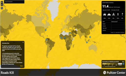
That toll has reached now 1.24 million per year and is on course to triple to 3.6 million per year by 2030.
In the developing world, where this pandemic has hit hardest, road accidents will become the fifth leading cause of death, leapfrogging past HIV/AIDS, malaria, tuberculosis and other familiar killers, according to the most recent Global Burden of Disease study. The victims, not so surprisingly, tend to be poor and overwhelmingly young and male.
This is exactly the kind of story we specialize in at the Pulitzer Center on Crisis Reporting. But how to tell it?
To have real impact, to reach the largest possible audience — and to continue to reach an audience for months and even years into the future — we quickly understood that we would have to create something organic, a storytelling platform that would have the ability to grow and expand and evolve over a period of time.
We also understood that this was a data-rich story, and that we needed to build a vehicle that could absorb vast quantities of data and dispense it in meaningful ways to a globally diverse audience that was likely to have a highly localized interest in the story.
DATA VISUALIZATION FOR AWARENESS
What we’ve come up with is “Roads Kill.” This is a project that draws on the Pulitzer Center’s extensive network of journalists in almost every corner of the world and harnesses their reporting skills to a digital platform that is flexible, spreadable (via social media) and fully embeddable.
The centerpiece is an interactive map designed and built by my colleague Dan McCarey. By clicking on a country you can access an assortment of road safety data, ranging from trend lines on highway fatalities to statistics on the types of vehicles most likely to be involved in fatal crashes. You can also rove across the map to access an ever-expanding roster of full reports and brief “roads facts” from around the world.
Dan says that tools like MapBox are revolutionizing the world of web maps and data visualization, making it possible to build robust experiences that work across all major devices.
“What we wanted to do with Roads Kill was allow people to explore on their own, but also provide a narrative. I think using the road safety facts to lead people through the map was an effective way to do that. As we add more stories, we’re hoping it will lead to some additional click-throughs,” he explained. “Traditionally, there’s generally been a separation between the ‘story’ and the ‘map.’ But now I think we’re going to see more and more examples of maps as storytelling devices.”
Thus far, the project has been very well received. Our plan now is to invite others, including news organizations, to make use of these resources — and to contribute stories of their own.
Reducing the number of highway deaths is an achievable goal. In 2010, the UN adopted a resolution calling for a “Decade of Action” on road safety. The plan is to stabilize and eventually reverse the upward trend in road fatalities — saving an estimated 5 million lives during the period. The Pulitzer Center and its media partners hope that by raising awareness of this growing but clearly fixable crisis, we can make journalism part of the solution.
Tom Hundley is senior editor at the Pulitzer Center on Crisis Reporting. Before joining the Pulitzer Center, Tom Hundley was a newspaper journalist for 36 years, including nearly two decades as a foreign correspondent for the Chicago Tribune. During that time he served as the Tribune’s bureau chief in Jerusalem, Warsaw, Rome and London, reporting from more than 60 countries. He has covered three wars in the Persian Gulf, the Arab-Israeli conflict and the rise of Iran’s post-revolutionary theocracy.

OMG!
What is wrong with the west? Why do they always distort the map of India?
I appreciate his efforts in putting together all this data but man when you are doing such a large analysis you must keep in mind to get the right map of a country. It hurts truly speaking. I hope you will pay attention to this.
Nobody cares about the shape of India.