
In our small lab at Stanford University, we’ve been prototyping new models of collaboration that bring journalists together with university researchers and scholars. We’re eager to share them because we hope that others will take them up, use them, and improve upon them. We believe journalists and scholars and researchers can — and should — be natural collaborators. And in our rapidly changing media landscape, we need each other more than ever. We share many of the same fundamental principles in seeking the truth and making it public — such as accuracy, fairness, and transparency of sources.
Still, scholars and researchers are most often simply used as sources for journalists. This is fine as far as it goes. But we believe that we can do more by collaborating. We can work together to research, report, and produce work that goes beyond what we can do alone, work that enriches public understanding and discussion of the crucial issues of our times and pushes the frontier of new digital, interactive technologies in journalism. While this approach is not without its challenges, we think it is more than worth the effort.
Origins of Our Lab
The Bill Lane Center for the American West — an interdisciplinary center for research, teaching, and reporting at Stanford — has always been committed to working with journalists and supporting great reporting on the West. Reporting is in our mission, and journalists are one important part of our constituency, along with scholars, researchers, policymakers, advocates, and the public. In 2009, Jon Christensen, a historian and former journalist, became executive director of the Center. Christensen had been one of the founders of the Spatial History Lab at Stanford, which uses digital data analysis, text mining, and mapping technologies for scholarly research and communication. He realized that the Center had an opportunity to bring journalists into these experiments, and produce new forms of reporting that are adapted to our rapidly shifting media landscape.
Christensen recruited me to join the Center while I was at Stanford on a Knight Journalism Fellowship, during which time had we collaborated on a historical mapping project. Previously, I had spent more than a decade at the online units of The New York Times, Le Monde and ABC News. Typically, a journalist’s role at a university consists of public relations work, and when the Center had such a position open, Christensen used it to bring me aboard. In asking me to join the Center, though, we discussed how we would transform the position into something completely different.
My job, in fact, was to create a small media laboratory in which scholars, researchers, and journalists could collaborate on interactive stories that use emerging multimedia, data visualization, and mapping techniques. With the emergence of HTML5, powerful free software libraries, and growing repositories of open data, it has never been easier to create interactive stories that engage readers and viewers around complex issues. But with journalism’s business side reeling, many news organizations are short on the time and resources required to fully take advantage of the opportunities at hand.
Transforming Fellowships into Opportunities for Journalistic Collaboration
So how did we go about fostering collaboration with reporters? In the past, the Center offered short-term media fellowships for journalists to come to Stanford, talk with scholars and researchers, and report on important regional issues. We retooled these fellowships into an opportunity to work together reporting and producing the kind of rich interactive online reports that many news organizations are simply unable to do on their own. We use two criteria to prioritize these fellowships and projects: We look for great journalism projects that can be enriched by interactive multimedia, data visualizations, and maps; and we look for projects that can push us to develop new technological applications that could be used by many other projects in the future, whether in journalism or scholarly communication. We especially like it when the two come together: great journalism and developing new vehicles for communication.
In the past year, we’ve published projects with KQED Public Media, the Texas Tribune, High Country News, and Harper’s Magazine. We’ve had our stories and interactive features republished on a number of other journalism sites, and on occasion seen them go viral through social media, blogs, and video sharing sites.
Click through this guide to see some of our recent projects.
Products from Our First Year of Collaboration
In June, we helped the Texas Tribune publish an interactive data visualization that compared water use and rates in the drought-parched state with other parts of the country. Clicking through a series of animated charts, users could see that typical households in Texas cities paid less for water — and used more — than those in relatively wet Seattle, Boston, and New York. As reporter Kate Galbraith wrote in the accompanying article, “Water experts say it is about time Texans placed more value on this irreplaceable natural resource, given the state’s rapid population growth and fickle weather.”
Galbraith used one of our media fellowships to travel to Stanford in February to do research and interview experts in water resources and civil engineering. We also used that time to sketch out a wireframe for the interactive graphic with freelance developer Scott Murray. After Kate returned to Austin, we continued to collaborate remotely as the design sketches and data research came together. The finished product ran with a multi-part series on water, titled “The Last Drop.”
“It was terrific to work with the Center on our value-for-water project,” Galbraith told us. “The interactive got a lot of great feedback. Everyone here was impressed with its sharp, easy-to-navigate presentation of a complex topic. It really communicated effectively the water challenges we face here in Texas and as a nation.”
In hindsight, we were fortunate with the timing: The Tribune was generous in giving Galbraith ample time to report out her story and the larger series it belonged to, and Scott Murray was very responsive and able to turn around versions of the interactive code quickly. In entering a collaboration that brings together people from separate institutions, it’s important to arrive with eyes wide open, a realistic production schedule, and the ability to plan for contingencies.
This spring, we had the opportunity to broker an even more complex collaboration among scientists, researchers and journalists. We teamed up with KQED’s science and environment program QUEST and the San Francisco Estuary Institute’s Aquatic Science Center to address one of the most complex and contentious stories in California: the fate of the Sacramento-San Joaquin Delta, the state’s most vital water source. The San Francisco Estuary Institute was nearing the end of a four-year study for the state of California on what the Delta looked like in 1800, before a century and a half of extensive modification by industry and agriculture.
We awarded a media fellowship to KQED reporter Lauren Sommer to work with us on an interactive multimedia package that would enable users to explore this complex environmental history and what it means for the present and future. Together we dug through the mountain of evidence that SFEI gathered for its historical ecology project.
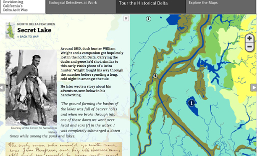
The resulting interactive feature, “Envisioning California’s Delta As It Was,” launched on KQED’s website in May. Through more than 20 pages of interactive maps, charts and archival imagery, the feature guided readers through the historical clues that researchers used to envision what the Delta was like before the Gold Rush, the creation of rich farmlands, and the aqueducts that carry water to farmlands and cities hundreds of miles away.
The collaboration was not a one-way street — in a departure from the typical journalistic custom, we worked closely with our partners at SFEI on editing the texts and curating the content. For their part, SFEI’s scientists also had to stretch their comfort zone, accepting that we would need to translate their precise but technical terminology into more accessible language that a general audience could understand.
Paul Rogers, the managing editor of QUEST, told us that the collaboration “was invaluable in helping us explain a complex but critically important topic. We see the partnership as a model of new science journalism that we hope to duplicate going forward.”
Making Tools Both Journalists and Scholars Can Use
Like journalists, scholars and researchers are also wrestling with the challenge of making sense of large data sets and communicating their findings. So we’ve experimented with developing tools and techniques that can be used by scholars and researchers as well as journalists. We recently received a “digital humanities startup” grant from the National Endowment for the Humanities to develop a visualization using natural language processing tools to “machine read” large collections of digitized newspapers and display the results over time and space.
Together with researchers at the University of North Texas and the Philadelphia-based agency Wi-Design, we developed an interface for browsing the results of word counts, named entity recognition, and topic modeling across 180 years of Texas newspapers. Using a map and multi-paned interactive graphic, users can slice and dice the results over time and space, and start to understand how the conversation about what was important in Texas ebbed and flowed over time. Our results will soon be published in peer-reviewed journals. We think journalists could also use these technologies. So we’ve shared our methods online and posted the source code for the visualizations on GitHub, the social coding site.
We’ve also shared another tool that we developed for journalists and scholars to connect video storytelling to deeper textual and interactive resources — an annotated video player that reveals related information, multimedia, and links to documents and sources at timed intervals during a video. I used a similar approach in my 2010 documentary about data visualization, “Journalism in the Age of Data.”
This new annotated video player is built in HTML, rather than Flash, making it compatible with a broader range of devices. The player uses the Mozilla Foundation’s “Popcorn” codebase, which makes it easier to integrate video with other objects on a web page — from text and links to Google Maps, Twitter streams, and other widgets that change automatically as the video plays. We used this new video player to collaborate with veteran NPR reporter John McChesney, who came to the Center to direct a project on the rural West. Together we produced an annotated documentary on the western energy boom, and how it is transforming communities and landscapes. The player enabled us to publish a 30-minute video documentary online, and simultaneously present additional rich content so that interested viewers could explore these critical issues more deeply. The PBS NewsHour directed viewers to our documentary during their recent series on the energy boom.
We hope to continue to enhance this annotated multimedia player, modifying it to play interactive graphics in sync with video narratives, and to make it easier to create enhanced video content. In the meantime, we’ve posted the source code of the project to GitHub for interested journalists, developers, and programmers to download and modify.
We would be thrilled to see other people extend and refine the player, and we hope to build it out further ourselves. We’d like to enable producers to synchronize animated data visualizations with the video playback, whereby a user could “pause” the video and interact directly with the visualization — to drill down for further detail, or step it back and forth, for example. And we’d also like to integrate it with emerging authoring tools like Mozilla’s upcoming “Webmaker” application that will make it possible for the less technically inclined to produce videos in our interactive format.
Harnessing Innovation, and Nurturing a Hub of Collaboration
Here at the Bill Lane Center for the American West, we have the good fortune to work with students, faculty, researchers, and developers in the computer science department, the design school, and the digital humanities at Stanford, all hotbeds of technological innovation. As an interdisciplinary center for research, teaching, and reporting, we’re also connected to many disciplines on campus. Our goal is to continue to harvest the knowledge that is generated here, as well as harness the innovations that are taking place here and in the online world at large, to collaborate with journalists to experiment with new ways of engaging the public in the important issues and stories of our times.
If you’re interested in the new hybrid collaborative models of journalism and communication we’re building here, we hope you’ll be in touch.
To learn more about the Bill Lane Center for the American West and our media fellowships and opportunities for collaboration, please visit http://west.stanford.edu, and write to me at [email protected].
Geoff McGhee (@mcgeoff) is the Creative Director for Media and Communications at the Bill Lane Center for the American West, a research, teaching and reporting institute at Stanford University. Prior to joining the center in 2010, he spent a decade doing infographics, multimedia and video for online news at The New York Times, ABC News and France’s Le Monde, where he worked on a wide range of stories, ranging from war and politics to natural disasters, history, art, and culture. 2009-2010, he spent a John S. Knight Journalism Fellowship at Stanford University studying data visualization, which resulted in the widely cited web documentary “Journalism in the Age of Data.”
