The way Americans looked at their neighboring cities, states and regions solidified into boundaries of reds and blues after the November presidential election. In that case, maps helped clarify how people voted, but didn’t offer clues why.
It can be hard for readers to keep track of their neighborhoods amid national news stories, especially given the gutting of many local newsrooms. To varying degrees, national news and other stories flood news consumers’ social media feeds and local news homepages. But if a crime occurred down the block, your child’s school has lead contamination, or a national publication talks up your bodega’s chopped-cheese sandwich, you’d want to know. So while cartographic and digital tools can help categorize people and regions, they can also reveal nuance and show how policies and current events influence their lives on a smaller scale.
An important skill for educators to teach prospective journalists is knowing when to use those tools, as well as when maps can stand on their own, and when they can be used to accent dogged reporting. At the CUNY Graduate School of Journalism, where I focused on urban reporting, I learned how to mix technology and traditional reporting tools.
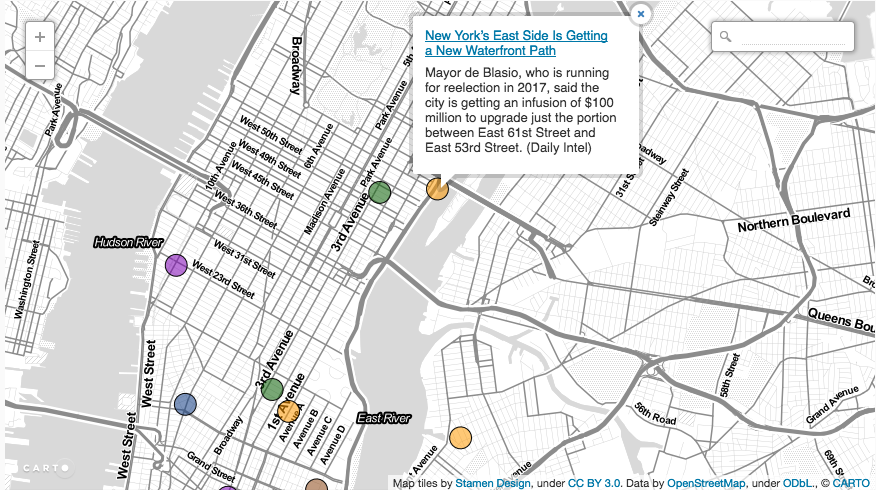
SpotCorner, a website I launched last fall, focuses on connecting different outlets’ work to residents, professionals and the people who have a stake in neighborhoods across New York City. Each entry — categorized by hard news, crime, business, food and drink, as well as local stories and history — is planted at the building, intersection or neighborhood where it happened. The map gives a look into the daily evolution of the changing city.
The project, which is an effort to unify the constellation of legacy media outlets, blogs and non-traditional news streams, is just one example of how mapping and cartographic tools can add value for news consumers and producers.
What to Build
For news reporters, the explosion of mapping tools is a chance to embrace new methods of telling stories. With tools such as Google Maps, MapBox, Carto and ArcGIS, storytellers can add an eye-in-the-sky element to illustrate trends. Each platform has its own benefits and drawbacks. For example, the learning curve on embeddable Google Maps – where you quickly “hunt-and-peck” to plot quick points – is pretty easy. Other tools offer a lot of customization, but require some time to learn.
Before you make a map, you should ask these questions:
Q1: What can be mapped?
Some institutions have embraced open data policies and make available a wealth of information they track. New York City’s Open Data portal has constantly updated information. For example, in the past month alone, the city has added data on bike lanes, wheelchair accessible taxis, and a spreadsheet where you can actually calculate how much animal poop that city parks workers cleaned up in a given year. Usually, you can download the data in a CSV or Excel-type format and upload into the mapping tool.
If you know what you’re looking for, you can request the information specifically from the government using the relevant freedom-of-information requests, or you can crowdsource it from readers. But you should also look at the fields to make sure that they’re accurate and aren’t filled with bad data that could skew the visualization.
Q2: What’s the story?
First, think of what people would want to know, and how to communicate it. Colors, heatmaps and can all be used to accentuate certain trends.
WNYC has mapped out schools with high concentrations of lead in water fountains, bringing a national concern into a very local focus. One website has offered a look at the prevalence of gun violence, offering a look at the destructive connective tissue that links every community. Climate change, which can seem like an abstract thing, is less so when flood levels are forecast years in advance, giving people advance time to prepare for disaster. And another tool created by a history nonprofit lets people see how another disaster — the 1906 earthquake — changed San Francisco.

Q3: How is your audience engaged?
Do you want people to keep returning to the map as a reference, or do you want to highlight something on a one-time basis? If you want to keep people returning to the map, or if you want to compare changes over time, you should make sure that the information is going to be collected on a regular basis.
As the map develops, other trends can emerge. One interesting side effect of SpotCorner is how it reveals the limitations and biases of the daily media (albeit in a very unscientific way). For one of the clearest examples, see Central Brooklyn and the South Bronx, areas that have a stubbornly high crime rate, even as much of New York City gets safer. The obvious takeaway is that little else but crime is happening in some neighborhoods, while others are a wealth of new bars and construction. Of course, that’s not true.
But local papers – whose finances are getting more strapped by the week – can’t spend as many resources to send local reporters to establish a stake in the neighborhood, so human interest and other worthwhile stories can lose ground to those stories.
But this conclusion can open a conversation and can help reporters check back in with those neighborhoods to help humanize people who live in those communities, to highlight their successes and to tread away from the rest of the pack.
These tools are still in their infancy. But as much of the media ecosystem is segmented by hyper-partisan rhetoric, uncertainty over “fake news,” and the never-ending torrent of social media streams, locally oriented tools will be vital for helping neighbors understand the risks, opportunities, history and the joy of the streets they share.
Dan Rosenblum is a senior reporter at New York Nonprofit Media, and the founder of SpotCorner.
