This article was originally published on the Chartbeat blog. It is republished here with permission.
In general, when we publish data, it’s always in anonymized, aggregated form — because that sort of data lets us identify the cross-network trends relevant to all publishers. Now and then, though, we have occasion to look deeply at one publisher’s data, which lets us pull out facts that might be obscured when aggregating across tens of billions of page views. This is one such special occasion.
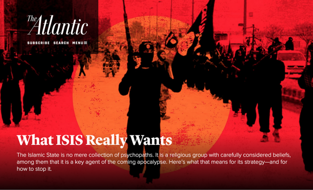
Many of you have seen our list of the 20 most-read articles of 2015. Today, we wanted to give you an analysis of the data behind the success of the most-read article on that list, The Atlantic’s March issue cover story, “What ISIS Really Wants” by contributing editor Graeme Wood. The piece is the most popular article in the history of The Atlantic and accrued more Total Engaged Time than any of the other 164 million pages published in 2015 across the Chartbeat network of 50,000 sites. On its way to becoming the most-read story of the year, this article availed itself of almost every conceivable audience-building opportunity — beginning with a carefully-executed launch, and then social media and publicity strategies designed to bring sustained attention to the piece. So the data around this article provides a fantastic lens into the mechanisms by which digital content can succeed.
Our list of top articles was calculated using Total Engaged Time — the sum across all page views of each visitor’s active Engaged Time — and the article was an outlier in terms of both components (page views and engaged time), so we’ll look into both traffic and engagement in turn.
Traffic Volume
From the perspective of traffic, this story was incredibly successful, receiving nearly 20 million page views between its publication in mid-February 2015 and the end of the year. As we see in the graph below, traffic occurred in three distinct phases: a huge initial volume of traffic upon release, a long tail showing steady traffic over a period of months, and a major second pickup coinciding with the Paris attacks. The patterns of traffic during each phase were quite different, so we’ll examine them one-by-one.

Initial spike (February 16-March)
The piece, along with the rest of the March issue, was posted to TheAtlantic.com the same week that the magazine appeared on newsstands. The page’s initial spike, as we see below, occurred simultaneously for a number of referrers, but the vast majority of traffic in the first four days was driven by Facebook. As we’ll see echoed in the November spike, Facebook has an unparalleled capability for generating massive spikes — spikes on other platforms are not nearly as large. Interestingly, as Facebook traffic died down on Feb. 20, Google traffic immediately picked up, perhaps in reaction to a number of media responses to the piece that were published on Feb. 20. This spike in Google traffic formed the basis of the next phase of traffic.

Interim period (April-October 2015)
Although, this window was quiet compared to the February and November spikes, the page garnered 2.4 million pageviews in this period by steadily accruing roughly 10,000 views per day. The main traffic driver in this period was Google search, which drove nearly a million pageviews. Twitter traffic was all but non-existent, and Facebook drove a more modest amount of traffic.

While Google carried the day, many other referrers drove what, for any other piece, would’ve been very significant amounts of traffic (traffic from other sites is captured in the “external links” line above). In particular, citations in, and cross-promotion from, the Washington Post drove 97,000 page views, The Huffington Post drove 42,000 page views, and The Guardian and CNN drove 19,000 page views each. Interestingly, audiences coming from other publications were much more engaged with the story than the overall audience, spending an average of over 5 minutes of engaged time on the piece (compared to an overall average of 3 minutes).
Paris attacks (November 13-December 31 2015)
The largest spike in the article’s history occurred during the Paris attacks of November 2015.

Clearly, the main traffic spike was from Facebook, but let’s zoom in to the beginning of the spike:
We see that Google search traffic spiked almost immediately after the attacks, nearly 12 hours before Facebook and Twitter traffic took off. This Google spike is a phenomenon we’ve been seeing for many breaking news events: While Facebook often delivers more traffic over the long term, Google is often the leading source of traffic in the first few minutes after an event. We also see an interesting phase change in Facebook’s promotion of the page at about noon UTC on Nov. 14.
Engagement
Beyond just high traffic, the article’s atypically high engagement crowned it as the most-read article of the year. Most stories receive an average of under 45 seconds of engaged time per page view; this one received over three minutes.
Engaged Time was very strong across all top referrers, including over 3 minutes, 30 seconds for visitors from Facebook, 2:20 for visitors from Google, and 4:15 for visitors coming from internal promotion. Similarly, engagement was strong on all devices, with an average engaged time of just under 3:00 for mobile and just over 3:40 for desktop.
Most stories receive an average of under 45 seconds of engaged time per pageview; this piece received over three minutes.
Let’s put engagement in the context of the article by looking at scroll depth instead of time. Because the article is so long and might take multiple visits to read, we’ll look at the maximum that each unique user attained, even if that took multiple page views. Note that the below figures measure scroll depth in pixels, so they understate scroll depth: 10,000 pixels, the first tick mark, is already over 2,000 words into the piece.

On desktop, over 40 percent of readers scrolled the first 10,000 pixels, and 24 percent of readers made it to the end of the article. Turning back to repeat visitors to the article, we see two types of repeat visits: visitors who come to the page on subsequent visits and immediately abandon the page (possibly, for example, because they’ve already read it), and visitors who read deeply on subsequent visits. In the first figure below we see scroll on subsequent visits across all readers:
That is, overall visitors scroll less when they visit the article later. However, when we restrict to only visitors who actually engage with the page, we see a different story. In the graph below, we look specifically at desktop readers who engaged with the page (as judged by an engaged time of 15 seconds). We see that on subsequent visits, these visitors scrolled significantly more deeply than on their first visit.
Final Insights
“What ISIS Really Wants” was literally a one-in-million success, and the vast majority of articles (including great ones), won’t garner anywhere near the level of engagement it received. Nonetheless, a look into its data shows a number of trends that are valuable for pieces of all sizes:
- Most critically, its place as the most-read article of the year clearly shows that there is a significant value associated with deeply researched, high-quality enterprise journalism. The other members of our top-20 list only serve to validate this statement.
- Facebook has no peers when it comes to driving massive traffic spikes; across two spikes, Facebook drove over 6 million page views to the piece.
- Search engine placement has its value both for long-tail traffic and during breaking news events.
- Even when facing down a tough subject and over 10,000 words, readers are willing to actually read, on all devices and across multiple sittings.
![]()
Josh Schwartz is Chief Data Scientist at Chartbeat, where he develops infrastructure and algorithms for the next generation of Chartbeat’s attention measurement products.
